
A little reaction. A lot of personality.
Floating emojis, rounded text bubbles, and your own React content. A quick pop, a gentle drift, a smooth fade. One small API, no runtime dependencies, and no stylesheet to import.
Interactive playground · API · Customization · Contributing
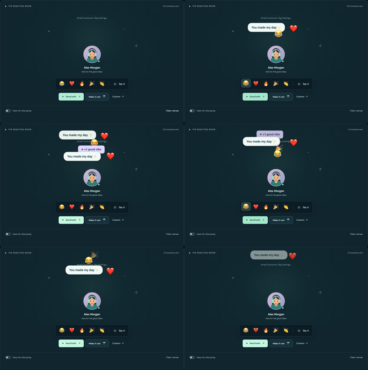
- React 18 and 19, TypeScript, ESM and CommonJS.
- Render any React node, with multiple targets and simultaneous reactions.
- Browser-native transform/opacity animation; no JavaScript frame loop.
- Portals escape ordinary clipping and stacking contexts.
- Automatic cleanup, burst limits, and device reduced-motion support.
- Safe to import and server-render; compatible with Next.js App Router.
npm install react-floating-bubblesReact and React DOM are peer dependencies. Use matching React versions.
import { FloatingBubblesProvider, useFloatingBubbles } from 'react-floating-bubbles';

function Player() {
  const { ref, emoji, text, custom } = useFloatingBubbles<HTMLDivElement>();

  return (
    <>
      <div ref={ref}>Alex Morgan</div>
      <button onClick={() => emoji('😂')}>Laugh</button>
      <button onClick={() => text('Nice hand!')}>Say something</button>
      <button
        onClick={() => {
          emoji('❤️');
          text('You made my day!');
        }}
      >
        Send both
      </button>
      <button onClick={() => custom(<strong>+1 ✨</strong>)}>Celebrate</button>
    </>
  );
}

export default function App() {
  return (
    <FloatingBubblesProvider>
      <Player />
    </FloatingBubblesProvider>
  );
}
Place one provider around all targets that should share settings and a burst limit. Use a hook for each target. Reactions start just above the element's top-center; their bottom edge aligns with that origin. No wrapper is added around your target.
Returns a stable API when its defaults and provider settings are stable:
| Member | Behavior |
|---|---|
ref |
Attach to your target element. The generic defaults to HTMLElement. |
emoji(string, options?) |
Float an emoji or emoji sequence. |
text(string, options?) |
Float a rounded message bubble. Plain text stays plain text. |
custom(ReactNode, options?) |
Float your own component, badge, image, or other React node. |
dismiss(id) |
Remove one bubble immediately. |
clear() |
Remove all bubbles in this provider, across every target. |
Each emission returns a unique string ID, or null when content is empty, the target is absent/disconnected, or the call happens on the server or after unmount. The target must be connected when called. Methods can be called from event handlers, effects, timers, or callbacks from your application's transport.
Provider defaults are merged with hook defaults, then per-call options. style and offset merge shallowly; undefined keeps the preceding value. Options are captured when a bubble is emitted.
| Option | Default | Description |
|---|---|---|
target |
Hook's ref | An Element, RefObject<Element | null>, or viewport { x, y } point. Per-call only. |
duration |
2200 |
Lifetime in milliseconds, from 1 to 60,000. |
delay |
0 |
Entrance delay in milliseconds, from 0 to 60,000. |
distance |
160 |
Travel in CSS pixels, from 0 to 4,000. |
direction |
'up' |
'up', 'right', 'down', 'left', or degrees clockwise from up. |
drift |
28 |
Maximum randomized lateral drift, in pixels (0–2,000). Set to 0 for repeatable drift. |
sway |
10 |
Lateral wave amplitude, in pixels (0–1,000). Set both drift and sway to 0 for a straight path. |
size |
36 / 14 |
Font size in pixels: emoji/custom content defaults to 36, text to 14. |
pop |
1.16 |
Entrance overshoot scale (1–3). 1 removes overshoot. |
rotation |
0 |
Rotation reached at the end of travel, in degrees. |
fadeStart |
0.78 |
Fraction of lifetime at which fading starts (0.25–0.95). |
offset |
{ x: 0, y: -12 } |
Offset from the origin, in CSS pixels. |
style |
— | React CSS properties on the content layer, separate from animation/positioning. |
className |
— | Class on the content layer for your CSS, utilities, or design system. |
Non-finite values fall back to defaults. Numeric values outside the supported ranges are clamped. The default pop overshoots at 8% of the lifetime, settles at 16%, remains fully visible to 78%, then fades to zero.
| Prop | Default | Description |
|---|---|---|
defaults |
{} |
Bubble options except target. |
maxBubbles |
64 |
Maximum active and delayed bubbles (1–1,000). Oldest are removed first. |
motion |
'auto' |
'auto' follows the device; 'reduced' uses opacity only; 'full' enables travel and pop. |
zIndex |
1000 |
Stacking order of the portal layer. |
container |
document.body |
Optional portal host, useful inside a modal dialog or fullscreen element. |
children |
— | Your application content. |
Nested providers are independent. clear() affects the nearest provider only. No portal root exists when there are no active bubbles. Native animation completion, cancellation, timeout, dismissal, eviction, and component unmount all clean up their animations and timers.
<FloatingBubblesProvider defaults={{ duration: 2600, distance: 180 }}>
  <Player />
</FloatingBubblesProvider>
const { ref, emoji, text } = useFloatingBubbles<HTMLDivElement>({ drift: 18 });
emoji('🔥', { size: 44, direction: 12, rotation: 10 });
text('Beautifully played!', {
duration: 3200,
size: 16,
style: {
background: '#d9fbe9',
color: '#153d32',
fontFamily: 'Inter, system-ui, sans-serif',
border: '1px solid #8fd6b4',
borderRadius: 20,
padding: '12px 18px',
boxShadow: '0 6px 24px #0002',
},
});emoji('👏', { target: otherPlayerRef });
// clientX/clientY already use viewport coordinates.
function handleClick(event: React.MouseEvent) {
emoji('✨', {
target: { x: event.clientX, y: event.clientY },
offset: { x: 0, y: 0 },
});
}Origins are measured at emission time. Bubbles continue independently in viewport space when the target moves, resizes, or scrolls. They do not track moving targets after launch. Horizontal launch positions are constrained to the viewport; unusually large travel distances, custom transforms, or sideways motion may intentionally carry content outside it.
const id = text('Great teamwork!', { offset: { x: -36 } });
emoji('❤️', { offset: { x: 50 }, delay: 100 });
custom(<span className="reward">✦ +25 XP</span>, { size: 16 });

if (id) dismiss(id);
clear();
Custom components inherit React context available at the provider, where the portal is rendered. Mount FloatingBubblesProvider inside any theme, localization, or other context that custom content needs.
function Player({ subscribe }: { subscribe: (onReaction: (value: string) => void) => () => void }) {
  const { ref, emoji } = useFloatingBubbles<HTMLDivElement>();
  React.useEffect(() => subscribe((value) => emoji(value)), [subscribe, emoji]);
  return <div ref={ref}>Player</div>;
}
The library owns no global singleton or networking connection. Pass hook methods to application callbacks, and return your subscription cleanup as usual. Memoize hook defaults if you use methods as effect dependencies.
The distributed entry points retain their 'use client' directive. Import the provider into a layout, and use the hook in a Client Component:
// app/layout.tsx (Server Component)
import { FloatingBubblesProvider } from 'react-floating-bubbles';

export default function Layout({ children }: { children: React.ReactNode }) {
  return (
    <html lang="en">
      <body>
        <FloatingBubblesProvider>{children}</FloatingBubblesProvider>
      </body>
    </html>
  );
}
// app/player.tsx
'use client';
import { useFloatingBubbles } from 'react-floating-bubbles';
export default function Player() {
const { ref, emoji } = useFloatingBubbles<HTMLButtonElement>();
return (
<button ref={ref} onClick={() => emoji('🎉')}>
Celebrate
</button>
);
}There is no module-scope access to window or document. The first server/client render contains application children only; the portal is created after mounting and only while bubbles exist.
Bubbles are temporary, decorative overlays: aria-hidden, inert, non-interactive, and excluded from keyboard navigation. They never take focus. Honor meaningful messages separately in a persistent message list or an appropriately scoped live region. Do not use a floating bubble as the only indication of an important state change.
motion="auto" observes prefers-reduced-motion, including changes while a bubble exists. Reduced mode keeps the same lifetime and replaces travel, rotation, and scale with a gentle opacity transition. Explicitly enable full motion only when the person using your application has opted in.
Supports modern evergreen browsers with React 18/19. Uses the Web Animations API, with a static timed fallback when unavailable. React/React DOM remain external peers. No stylesheets, fonts, images, or network requests are loaded by the library.
The default portal escapes ancestor overflow: hidden and transformed application wrappers. A transformed html/body, or an explicitly transformed custom portal host, changes fixed-position coordinates: keep that host in viewport coordinate space. A regular body portal cannot appear above the browser's top layer; pass a host inside the active <dialog> or fullscreen element. Inline React styles must be permitted by your Content Security Policy.
Node 22.12+ or 24+ is recommended for the development tools. The built library targets ES2020.
npm ci
npm run build
npm run dev
npm run check
npm run demo:build
npx playwright install --with-deps
npm run test:e2e
The playground resolves the package name to the built public entry point. It does not contain a second implementation of the animation. Rebuild the library after source changes.
CI checks formatting, types, unit/integration tests with coverage, package size/exports, isolated installation of the packed tarball, and real browser interaction/accessibility tests. React 18 and 19 are tested independently. Release instructions explain the initial authenticated publish and subsequent token-free releases.
floating-icons provides framework-independent floating HTML icons. party.js provides a broader particle engine. This package focuses on React nodes, rounded text, a shared pop/float/fade behavior, and safe server imports. React portals supply the rendering mechanism, and the Web Animations API supplies animation playback. A general physics or particle engine would add machinery this API does not need.
MIT © 2026 Saeed ET