AutoPlots is a comprehensive R visualization toolkit built on top of echarts4r, providing a consistent, ultra-customizable API across dozens of chart types — from classical analytics plots to advanced modeling visualizations and 3D charts.
AutoPlots exposes the full power of ECharts.js without requiring users to write JavaScript. If a feature exists in ECharts, AutoPlots aims to make it available.
30+ high-quality plot types — all with consistent argument naming
Full access to ECharts options using the xxx.* naming convention
No JavaScript required
Shiny-ready out of the box
Supports multi-plot layouts via display_plots_grid()
3D visualizations, modeling plots, river charts, radar, parallel, contour, density, and more
Designed for data science, EDA, dashboards, and model evaluation
AutoPlots is built around these principles:
Every plot is a standalone object Modify, tweak, and filter each one independently.
Composition happens outside the plot Use display_plots_grid() to arrange multiple plots into dashboards.
Expose full ECharts power without JS Legend, toolbox, tooltip, axis, series, grid, animation, theme — everything is adjustable.
Beautiful defaults, infinite customization Beginners get great plots immediately; experts can tune everything.
# Install CRAN dependencies
install.packages(c(
  "combinat", "data.table", "devtools", "dplyr", "e1071", "echarts4r",
  "lubridate", "nortest", "quanteda", "quanteda.textstats", "scales"
))

# Install AutoPlots from GitHub
devtools::install_github("AdrianAntico/AutoPlots", upgrade = FALSE, force = TRUE)library(AutoPlots)
dt <- data.table::data.table(x = rnorm(1000))
AutoPlots::Density(dt, XVar = "x")
ap_realize_request draws a CommunicationIntelligence realization request only after that package replays the request. An identity string or a hash on a modified record is not authentication. The figure keeps the admitted numbers, units, and source revision. It does not grant scientific qualification, human approval, or publication.
ci_open_communication and ci_realize_text still produce text, not this figure. ap_bind_pattern_request is the AutoPlots host path that asks CommunicationIntelligence for a pattern-inspection request. A later CommunicationIntelligence change would be required before those two text helpers call AutoPlots.
A refusal is the result when the request is not authenticated, the encoding would change the estimand without authority, or the requested geometry would misrepresent the admitted numbers. Log10 points are the only supported non-identity scale, and only with a receipt whose subject binds list(scale = "log10", quantity_ids, values) for those admitted numbers.
library(AutoPlots)

# This call is executable without owner packages. It cannot draw.
refused <- ap_realize_request(NULL, NULL)
stopifnot(identical(refused$status, "REFUSED"), isFALSE(refused$release_authorized))

# A rendered figure requires CommunicationIntelligence 0.1.3 and a live owner
# admission. The number below is not typed in: FinancialIntelligence returns it.
admitted <- CommunicationIntelligence::ci_admit_owner_call(
  "FinancialIntelligence", "fi_bs",
  list(spot = 100, strike = 100, rate = 0.01, vol = 0.2, horizon = 1),
  list(list(id = "value", path = "value")),
  "0.4.8", "2026-10-09T00:00:00Z", "one closed-form value")
bound <- ap_bind_pattern_request(admitted$value, "readme-fi-bs")
figure <- ap_realize_request(bound$request, bound$task)
stopifnot(identical(figure$status, "RENDERED"), isFALSE(figure$release_authorized),
  identical(figure$human_judgment, "UNRESOLVED"),
  identical(figure$scientific_qualification, "NOT_GRANTED"))
print(figure$geometry[, c("quantity_id", "value", "display", "y0", "y1", "ymin_axis", "ymax_axis")])
# The PNG path is figure$file. The geometry, not a screenshot, is the numerical record.- Area
- Bar
- Box
- Copula
- Correlogram
- Density
- Donut
- Heatmaps
- Histogram
- Line
- Parallel
- Pie
- Radar
- River
- Rosetype
- Scatter
- Stacked Bar
- Step
- Treemap
- 3D Bar
- 3D Scatter
- 3D Copula
- Word Cloud
- Autocorrelation
- Calibration
- Calibration Scatter
- Confusion Matrix Heatmap
- Gain
- Lift
- Partial Autocorrelation
- Partial Dependence
- Partial Dependence Heatmap
- Probability
- ROC
- Shapely Importance
- Variable Importance
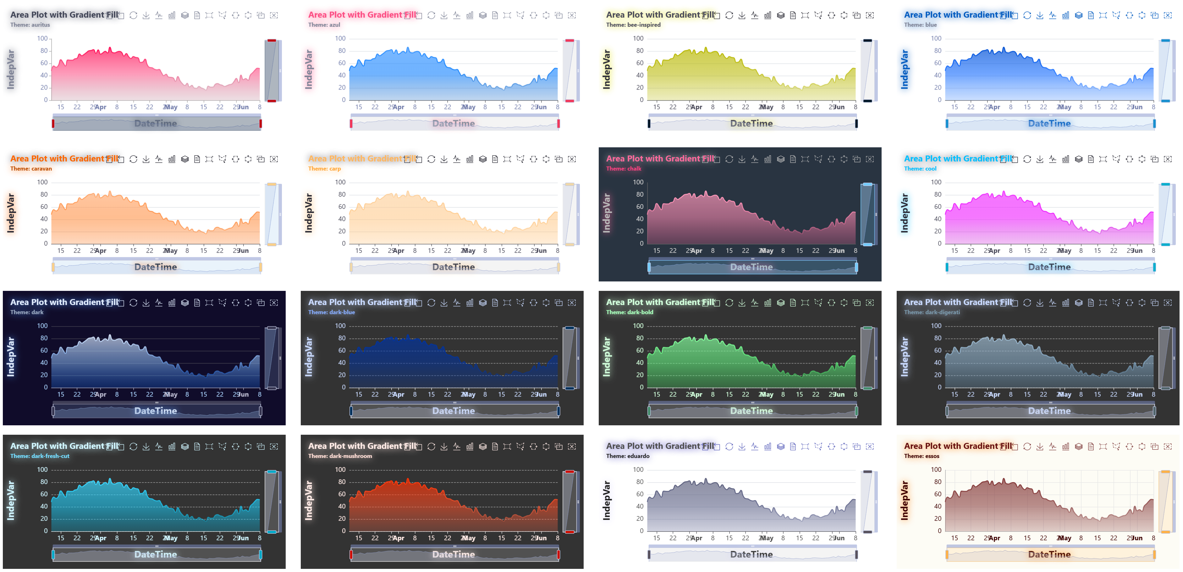
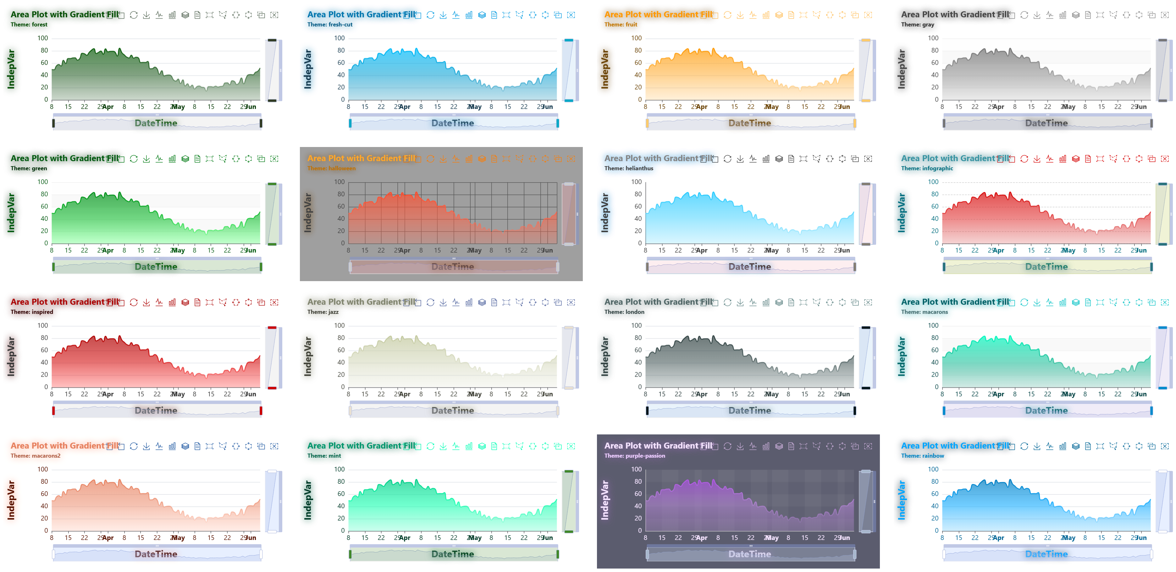
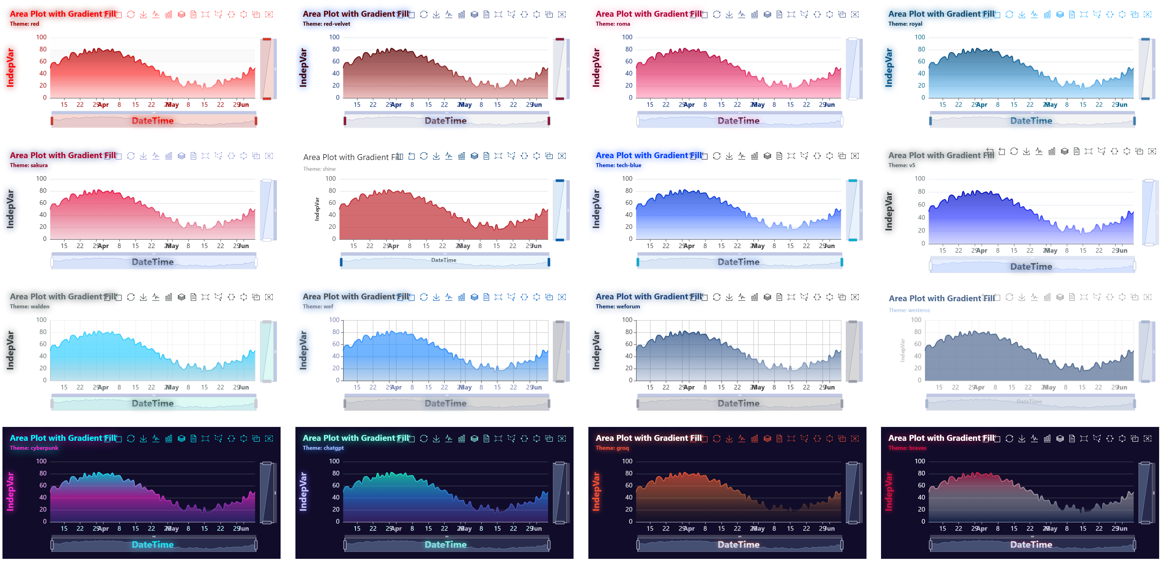
If you select one of these themes for the Theme parameter of any given plot type, you'll get an enhanced version of the original:
- auritus,
- azul
- bee-inspired
- blue
- caravan
- carp
- chalk
- cool
- dark
- dark-blue
- dark-bold
- dark-digerati
- dark-fresh-cut
- dark-mushroom
- eduardo
- essos
- forest
- fresh-cut
- fruit
- gray
- green
- halloween
- helianthus
- infographic
- inspired
- jazz
- london
- macarons
- macarons2
- mint
- purple-passion
- red
- red-velvet
- roma
- royal
- sakura
- v5
- walden
- wef
- weforum
AutoPlots includes built-in themes that can be selected through the Theme argument.
The screenshots below use the Area plot as a consistent example to showcase the available theme styles.
You can modify theming by essentially updating the below list of parameters for a given plot. The example below was used to create the "braves" theme (for Atlanta Braves).
Click for parameters
areaStyle.color = c("#CE1141","#FFFFFF","#13274F")
title.textStyle.color = "#FFFFFF"
title.textStyle.fontWeight = "bolder"
title.textStyle.textShadowColor = "#CE1141"
title.textStyle.textShadowBlur = 14
title.textStyle.textShadowOffsetX = 0
title.textStyle.textShadowOffsetY = 0
title.top = 12
title.left = 12
title.padding = c(4, 4, 10, 4)
title.itemGap = 6
title.subtextStyle.color = "#CE1141"
title.subtextStyle.textShadowColor = "#CE1141"
title.subtextStyle.textShadowBlur = 8
title.subtextStyle.textShadowOffsetX = 0
title.subtextStyle.textShadowOffsetY = 0
title.subtextStyle.fontWeight = "bold"
xAxis.nameTextStyle.fontSize = 20
xAxis.nameTextStyle.color = "#FFFFFF"
xAxis.nameTextStyle.textShadowColor = "#CE1141"
xAxis.nameTextStyle.textShadowBlur = 8
xAxis.nameTextStyle.textShadowOffsetX = 0
xAxis.nameTextStyle.textShadowOffsetY = 0
xAxis.axisLabel.color = "#E8EEF7"
xAxis.axisLabel.overflow = "truncate"
yAxis.nameTextStyle.fontSize = 20
yAxis.nameTextStyle.padding = 60
yAxis.nameTextStyle.color = "#CE1141"
yAxis.nameTextStyle.textShadowColor = "#CE1141"
yAxis.nameTextStyle.textShadowBlur = 10
yAxis.nameTextStyle.textShadowOffsetX = 0
yAxis.nameTextStyle.textShadowOffsetY = 0
yAxis.axisLabel.color = "#F3F6FB"
tooltip.backgroundColor = "rgba(12, 35, 64, 0.96)"
tooltip.textStyle.color = "#FFFFFF"
toolbox.iconStyle.borderColor = "#FFFFFF"
toolbox.emphasis.iconStyle.borderColor = "#CE1141"
Below are the full set of examples for standard plots.
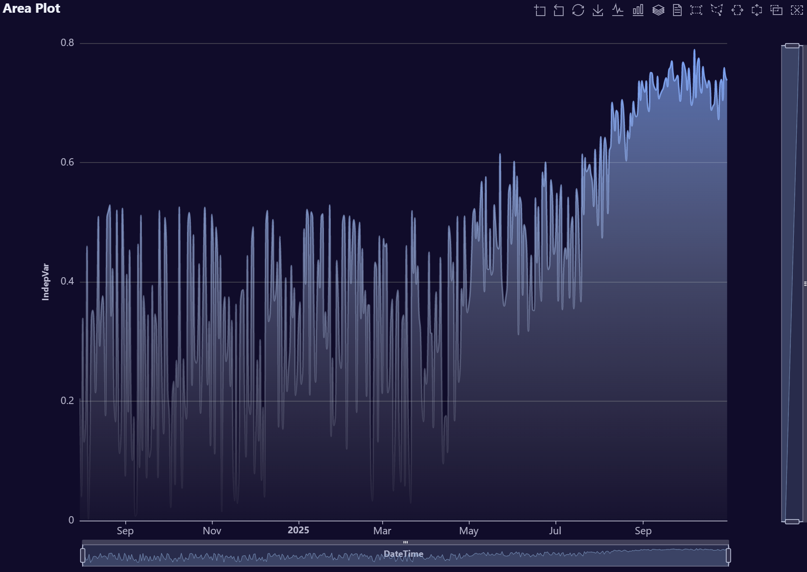
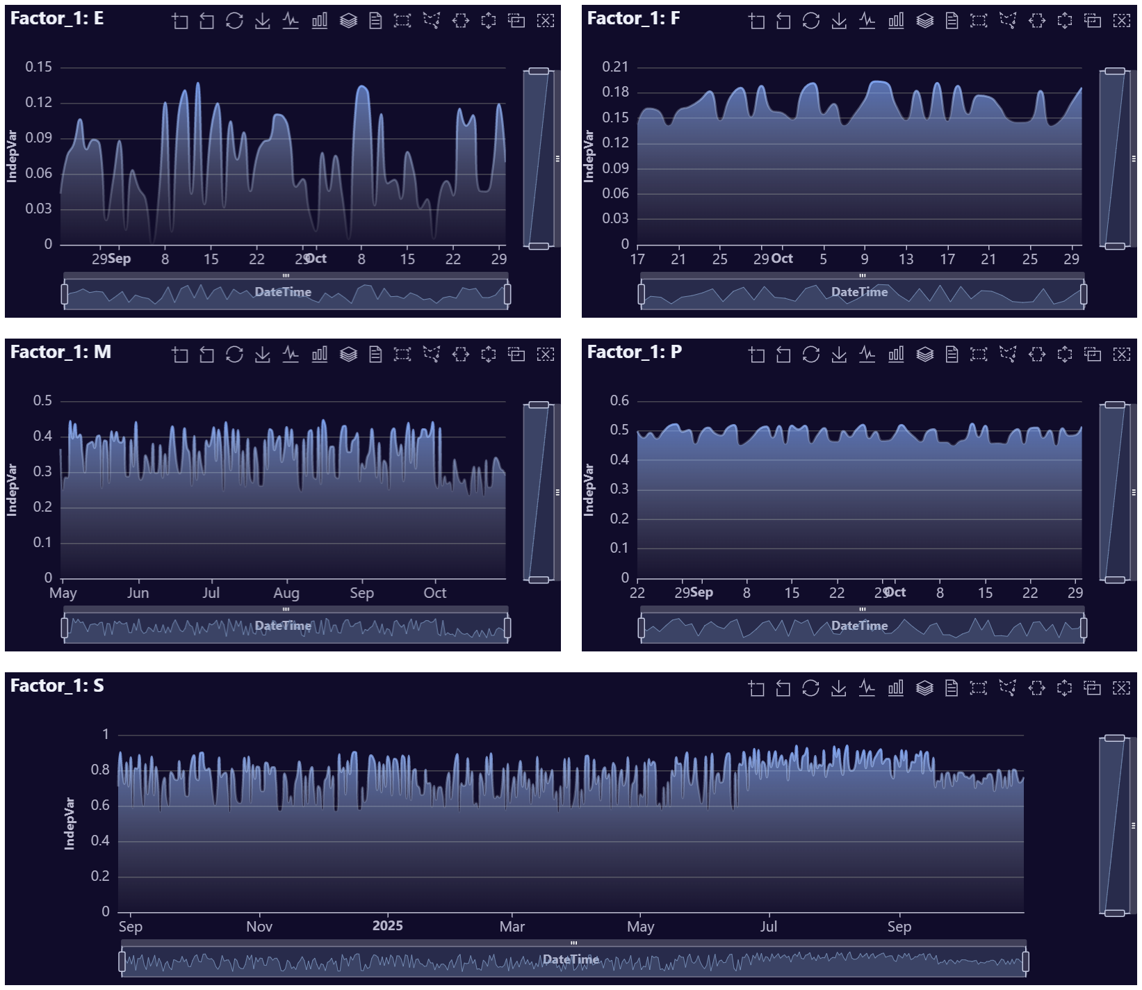
Area Plot Examples
# Create example data (no FakeDataGenerator)
data <- data.table::data.table(
  DateTime = seq.Date(
    from = Sys.Date() - 89,
    to   = Sys.Date(),
    by   = "day"
  )
)

# Smooth wave + a bit of noise for a nice area shape
data[, IndepVar := 50 +
       30 * sin(seq(0, 2 * pi, length.out = .N)) +
       stats::rnorm(.N, mean = 0, sd = 3)]

# Optional: ensure values stay positive for cleaner visuals
data[IndepVar < 0, IndepVar := 0]

# Build plot
AutoPlots::Area(
  dt = data,
  XVar = "DateTime",
  YVar = "IndepVar",
  title.text = "Area Plot with Gradient Fill",
  title.subtext = "Theme: dark"
) |> AutoPlots::e_grid_full(
  grid.left = 95,
  grid.right = 55,
  grid.top = 75
)
# Create fake data
data <- AutoPlots::FakeDataGenerator(N = 1000)
data <- data[, .(
  IndepVar = mean(Independent_Variable8)
), by = c("DateTime", "Factor_1")]

# Build plot
ch <- as.character(sort(unique(data$Factor_1)))
plot_list <- lapply(ch, function(x) {
  AutoPlots::Area(
    dt = data[Factor_1 == x],
    XVar = "DateTime",
    YVar = "IndepVar",
    Height = "300px",
    title.text = paste0("Factor_1: ", x))
})

AutoPlots::display_plots_grid(
  plot_list,
  cols = 2
)
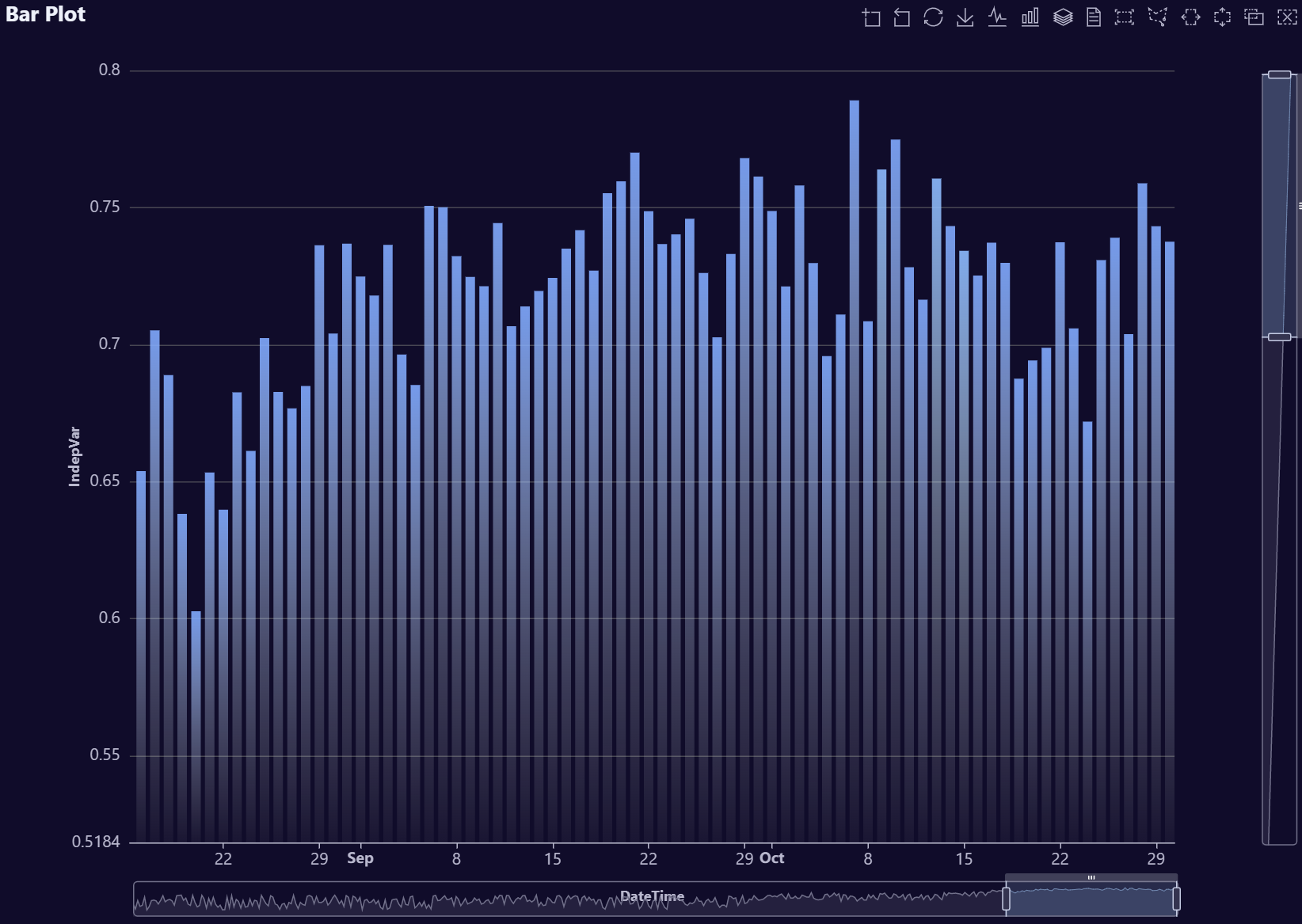
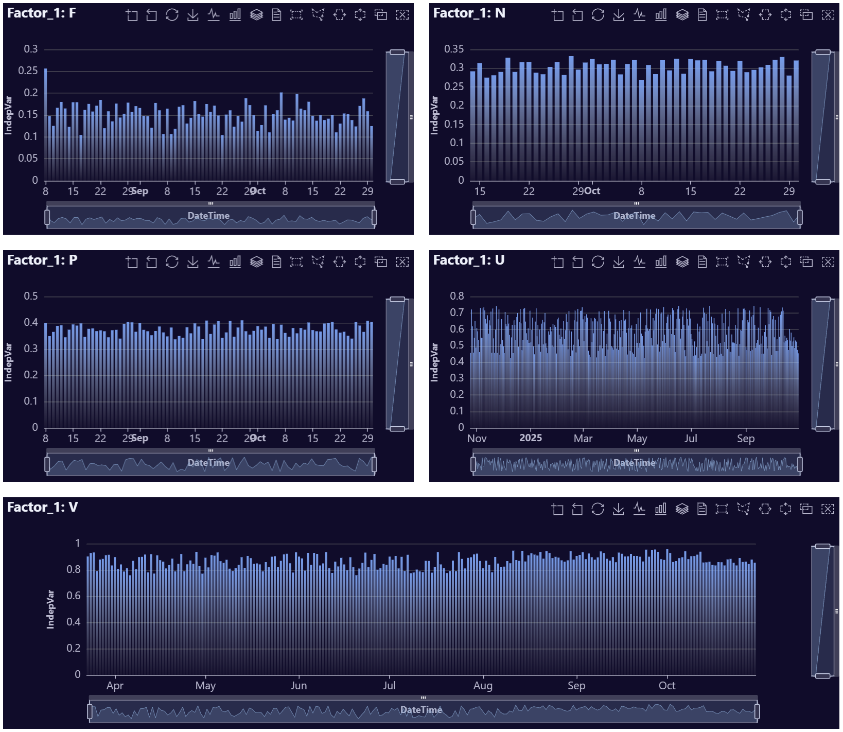
Bar Plot Examples
# Create example data (no FakeDataGenerator)
data <- data.table::data.table(
  DateTime = seq.Date(
    from = Sys.Date() - 89,
    to   = Sys.Date(),
    by   = "day"
  )
)

# Smooth wave + a bit of noise for a nice area shape
data[, IndepVar := 50 +
       30 * sin(seq(0, 2 * pi, length.out = .N)) +
       stats::rnorm(.N, mean = 0, sd = 3)]

# Optional: ensure values stay positive for cleaner visuals
data[IndepVar < 0, IndepVar := 0]

# Build plot
AutoPlots::Bar(
  dt = data,
  XVar = "DateTime",
  YVar = "IndepVar",
)
# Create fake data
data <- AutoPlots::FakeDataGenerator(N = 1000)
data <- data[, .(
  IndepVar = mean(Independent_Variable8)
), by = c("DateTime", "Factor_1")]

# Build plot
ch <- as.character(sort(unique(data$Factor_1)))
plot_list <- lapply(ch, function(x) {
  AutoPlots::Bar(
    dt = data[Factor_1 == x],
    XVar = "DateTime",
    YVar = "IndepVar",
    Height = "300px",
    title.text = paste0("Factor_1: ", x)
  )
})

AutoPlots::display_plots_grid(
  plot_list,
  cols = 2
)
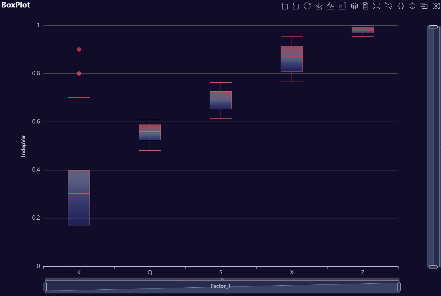
Box Plot Examples
# Create boxplot demo data with intentional outliers
set.seed(123)
n_per_group <- 60

data <- data.table::data.table(
  Factor_1 = factor(rep(c("Group A", "Group B", "Group C", "Group D"), each = n_per_group))
)

# Base distributions
data[, Independent_Variable8 := c(
  rnorm(n_per_group, mean = 40, sd = 4),
  rnorm(n_per_group, mean = 55, sd = 5),
  rnorm(n_per_group, mean = 70, sd = 6),
  rnorm(n_per_group, mean = 85, sd = 7)
)]

# Add controlled outliers per group
outliers <- data.table::data.table(
  Factor_1 = factor(c(
    rep("Group A", 6),
    rep("Group B", 7),
    rep("Group C", 8),
    rep("Group D", 6)
  ), levels = levels(data$Factor_1)),
  Independent_Variable8 = c(
    rnorm(6, mean = 25, sd = 2),   # A: low outliers
    rnorm(7, mean = 45, sd = 3),   # B: low-ish outliers
    rnorm(8, mean = 100, sd = 3),  # C: high outliers
    rnorm(6, mean = 115, sd = 4)   # D: high outliers
  )
)

data <- rbind(data, outliers)

# Safety: no negatives
data[Independent_Variable8 < 0, Independent_Variable8 := 0]

# Final box plot
AutoPlots::Box(
  dt = data,
  XVar = "Factor_1",
  YVar = "Independent_Variable8",
  yAxis.title = "IndepVar"
)
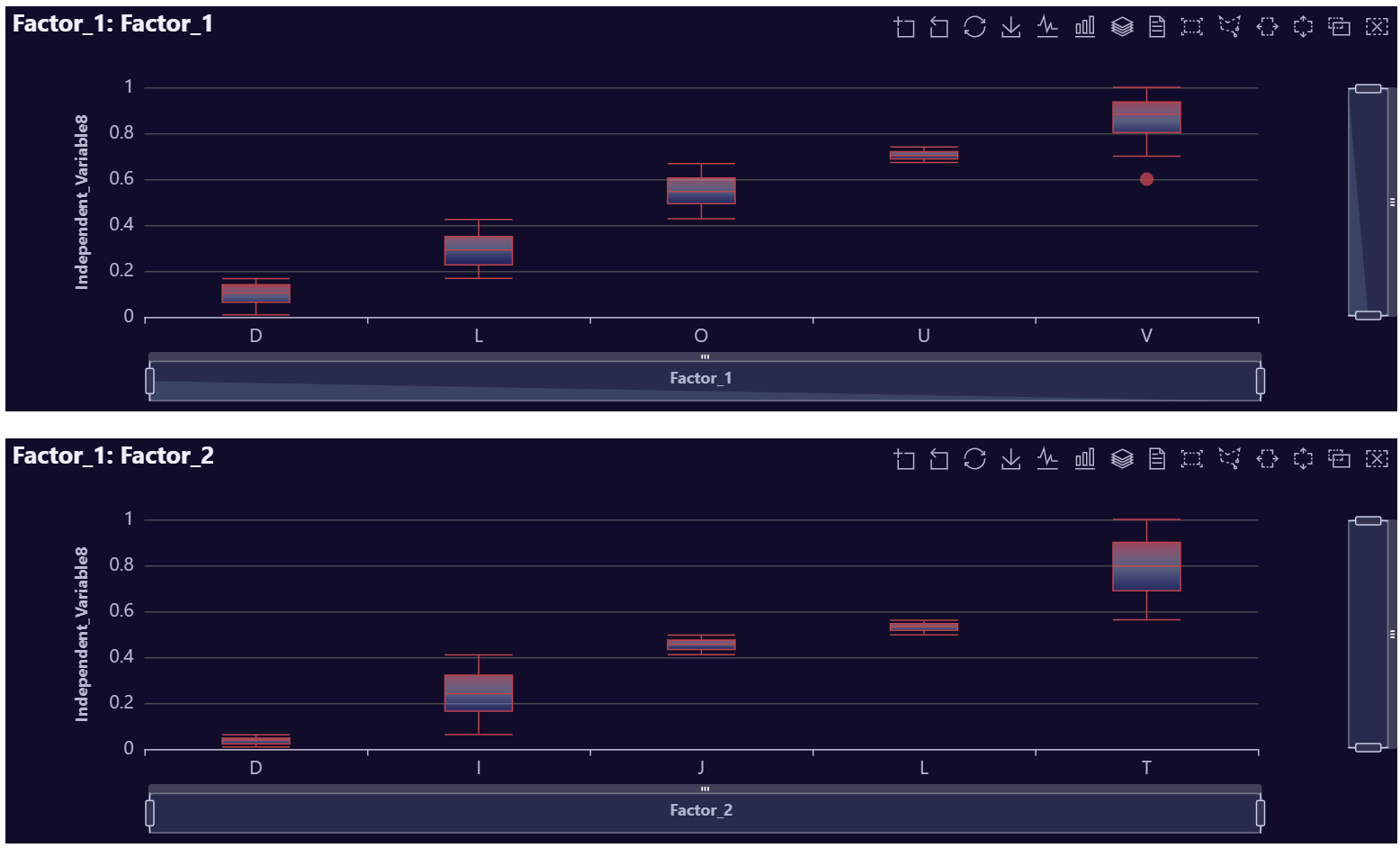
# Create fake data
data <- AutoPlots::FakeDataGenerator(N = 1000)
data[1, Independent_Variable8 := 0.6]
data[2, Independent_Variable8 := 0.7]
data[3, Independent_Variable8 := 0.8]
data[4, Independent_Variable8 := 0.9]

# Build plot
ch <- c("Factor_1", "Factor_2")
plot_list <- lapply(ch, function(x) {
  AutoPlots::Box(
    dt = data,
    XVar = x,
    YVar = "Independent_Variable8",
    Height = "400px",
    title.text = paste0("Factor_1: ", x)
  )
})

AutoPlots::display_plots_grid(
  plot_list,
  cols = 1
)
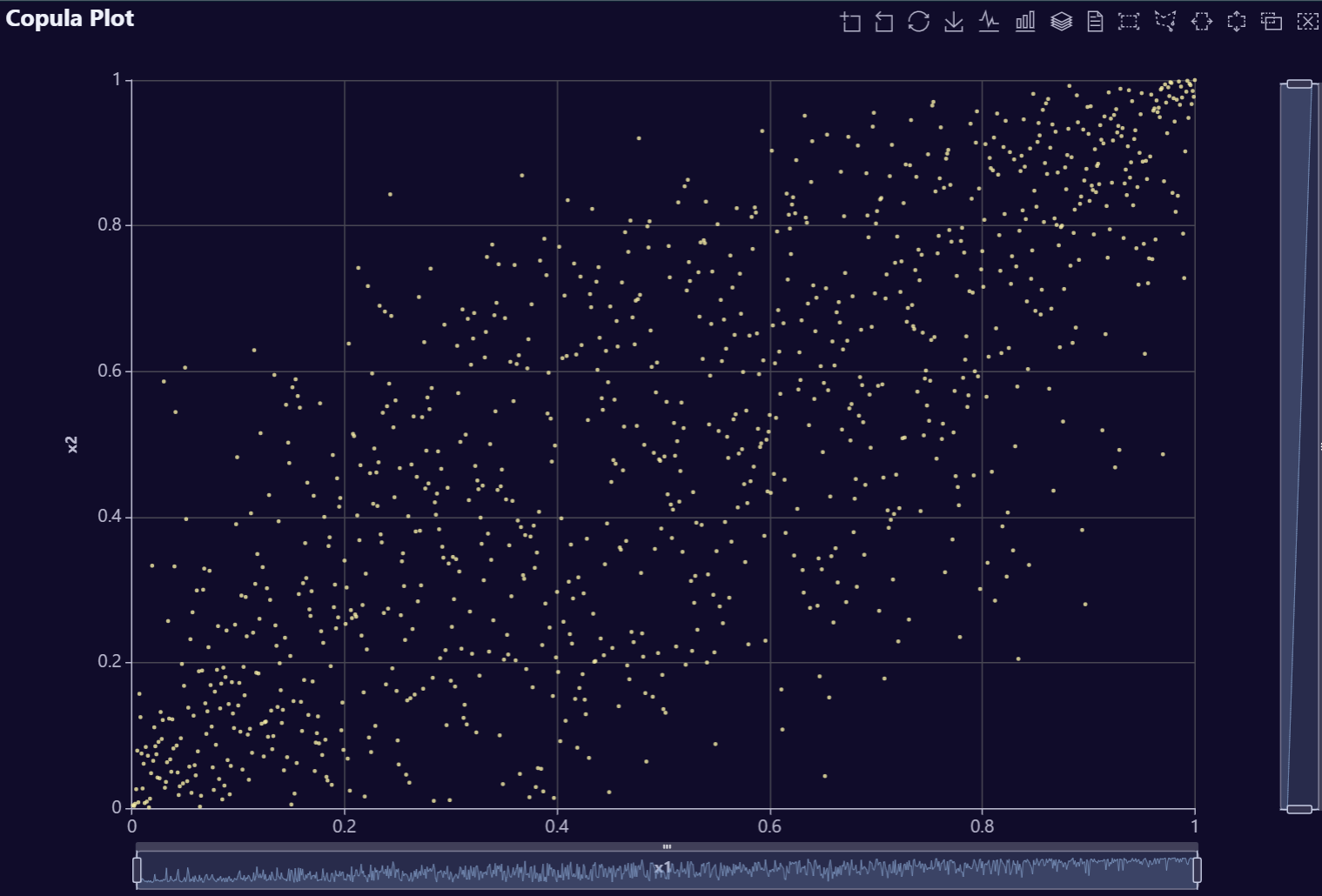
Copula Plot Examples
# Create correlated data
n   <- 1000        # rows
p   <- 4           # number of variables
rho <- 0.8         # correlation between neighbors (AR(1))
mu  <- c(50, 100, 0, 10)     # means (length p)
sds <- c(10, 5, 3, 1)        # standard deviations (length p)
Sigma_cor <- outer(1:p, 1:p, \(i, j) rho^abs(i - j))   # AR(1) correlation matrix
L <- chol(Sigma_cor)                                   # Cholesky factor (upper-tri)
Z <- matrix(rnorm(n * p), nrow = n, ncol = p)          # iid N(0,1)
X_cor <- Z %*% L                                       # correlated, unit variance
X <- X_cor %*% diag(sds)                               # set std devs
X <- sweep(X, 2, mu, `+`)                              # set means
dt <- data.table::as.data.table(X)
data.table::setnames(dt, paste0("x", seq_len(p)))

# Build plot
AutoPlots::Copula(
  dt = dt,
  XVar = "x1",
  YVar = "x2"
)
# Create correlated data
n   <- 1000        # rows
p   <- 4           # number of variables
rho <- 0.8         # correlation between neighbors (AR(1))
mu  <- c(50, 100, 0, 10)     # means (length p)
sds <- c(10, 5, 3, 1)        # standard deviations (length p)
Sigma_cor <- outer(1:p, 1:p, \(i, j) rho^abs(i - j))   # AR(1) correlation matrix
L <- chol(Sigma_cor)                                   # Cholesky factor (upper-tri)
Z <- matrix(rnorm(n * p), nrow = n, ncol = p)          # iid N(0,1)
X_cor <- Z %*% L                                       # correlated, unit variance
X <- X_cor %*% diag(sds)                               # set std devs
X <- sweep(X, 2, mu, `+`)                              # set means
dt <- data.table::as.data.table(X)
data.table::setnames(dt, paste0("x", seq_len(p)))

# Build plot
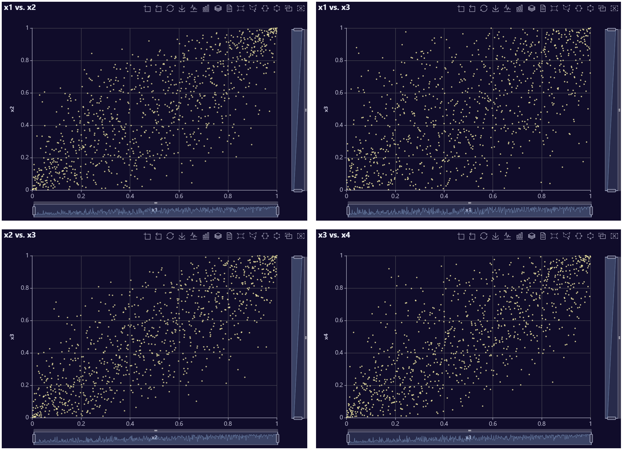
p1 <- AutoPlots::Copula(
  dt = dt,
  XVar = "x1",
  YVar = "x2",
  title.text = "x1 vs. x2"
)

# Build plot
p2 <- AutoPlots::Copula(
  dt = dt,
  XVar = "x1",
  YVar = "x3",
  title.text = "x1 vs. x3"
)

# Build plot
p3 <- AutoPlots::Copula(
  dt = dt,
  XVar = "x2",
  YVar = "x3",
  title.text = "x2 vs. x3"
)

# Build plot
p4 <- AutoPlots::Copula(
  dt = dt,
  XVar = "x3",
  YVar = "x4",
  title.text = "x3 vs. x4"
)

AutoPlots::display_plots_grid(
  list(p1,p2,p3,p4),
  cols = 2
)
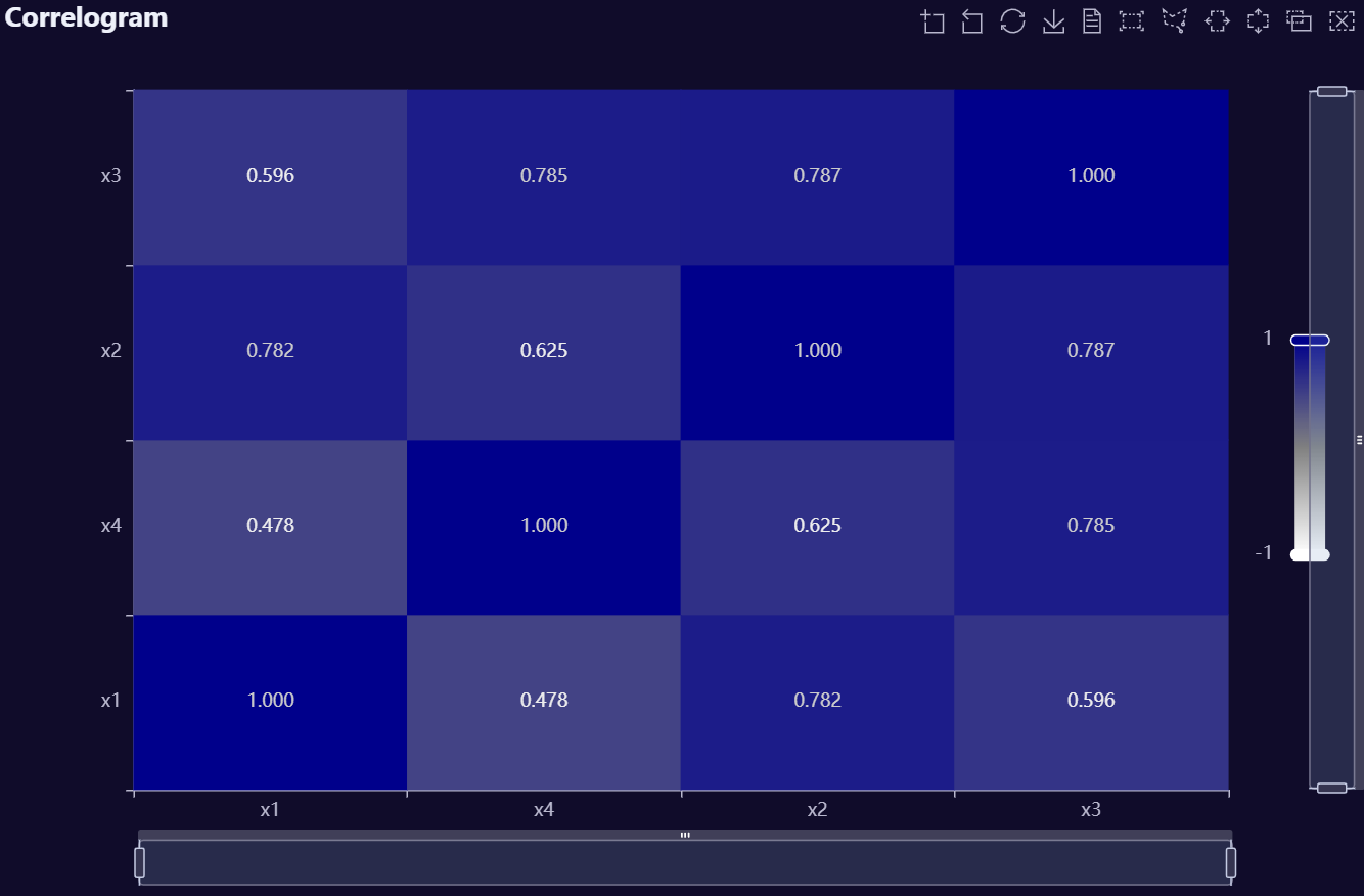
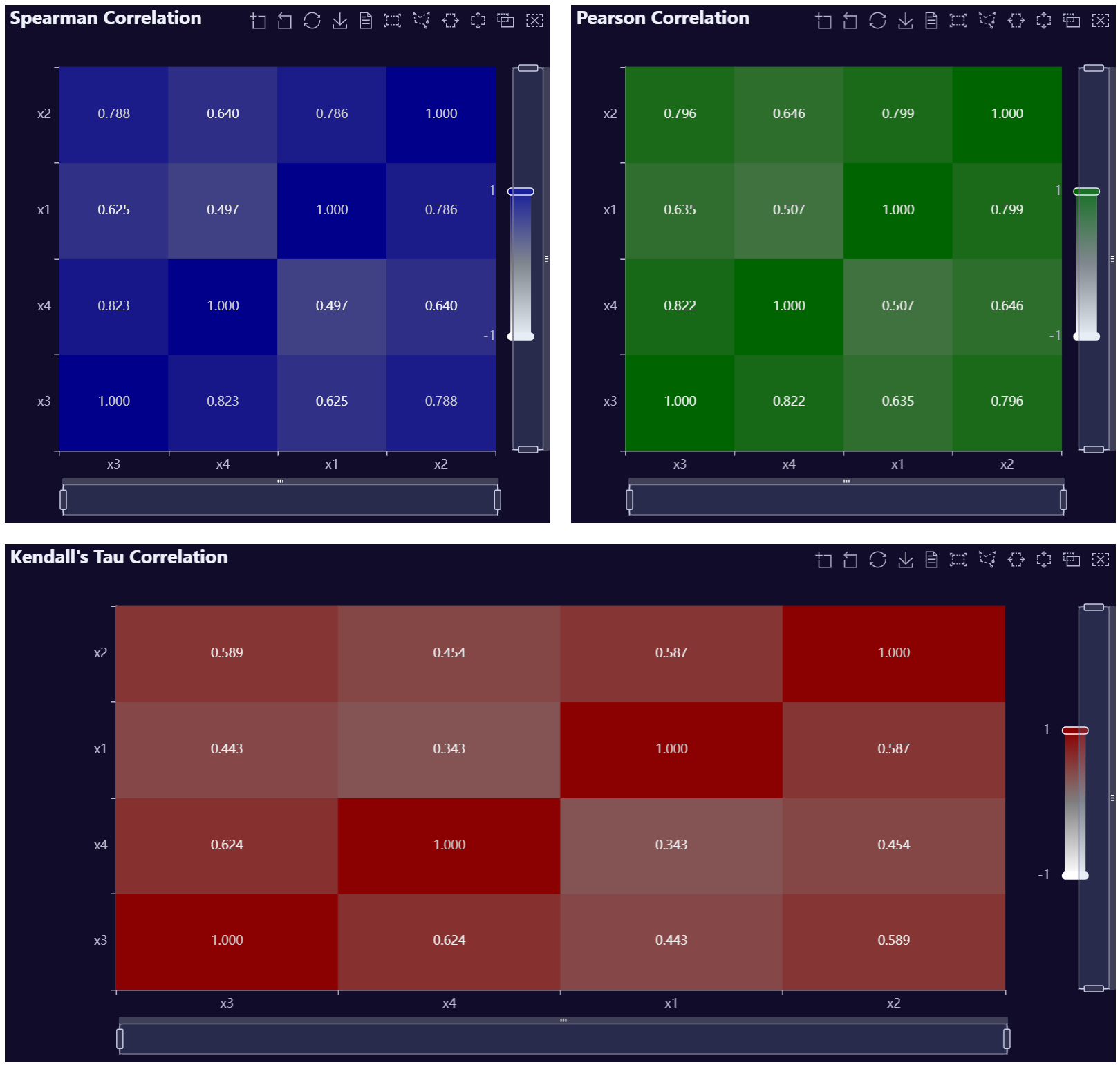
Correlogram Examples
n   <- 1000        # rows
p   <- 4           # number of variables
rho <- 0.8         # correlation between neighbors (AR(1))
mu  <- c(50, 100, 0, 10)     # means (length p)
sds <- c(10, 5, 3, 1)        # standard deviations (length p)
Sigma_cor <- outer(1:p, 1:p, \(i, j) rho^abs(i - j))   # AR(1) correlation matrix
L <- chol(Sigma_cor)                                   # Cholesky factor (upper-tri)
Z <- matrix(rnorm(n * p), nrow = n, ncol = p)          # iid N(0,1)
X_cor <- Z %*% L                                       # correlated, unit variance
X <- X_cor %*% diag(sds)                               # set std devs
X <- sweep(X, 2, mu, `+`)                              # set means
dt <- data.table::as.data.table(X)
data.table::setnames(dt, paste0("x", seq_len(p)))

# Build Plot
AutoPlots::CorrMatrix(
  dt = dt,
  PreAgg = FALSE,
  Method = "Spearman",
  CorrVars = c("x1","x2","x3","x4")
)
n   <- 1000        # rows
p   <- 4           # number of variables
rho <- 0.8         # correlation between neighbors (AR(1))
mu  <- c(50, 100, 0, 10)     # means (length p)
sds <- c(10, 5, 3, 1)        # standard deviations (length p)
Sigma_cor <- outer(1:p, 1:p, \(i, j) rho^abs(i - j))   # AR(1) correlation matrix
L <- chol(Sigma_cor)                                   # Cholesky factor (upper-tri)
Z <- matrix(rnorm(n * p), nrow = n, ncol = p)          # iid N(0,1)
X_cor <- Z %*% L                                       # correlated, unit variance
X <- X_cor %*% diag(sds)                               # set std devs
X <- sweep(X, 2, mu, `+`)                              # set means
dt <- data.table::as.data.table(X)
data.table::setnames(dt, paste0("x", seq_len(p)))

# Build Plot
p1 <- AutoPlots::CorrMatrix(
  dt = dt,
  PreAgg = FALSE,
  Method = "Spearman",
  CorrVars = c("x1","x2","x3","x4"),
  visualMap.InRange.color = c("white", "gray", "darkblue"),
  title.text = "Spearman Correlation"
)

p2 <- AutoPlots::CorrMatrix(
  dt = dt,
  PreAgg = FALSE,
  Method = "Pearson",
  CorrVars = c("x1","x2","x3","x4"),
  visualMap.InRange.color = c("white", "gray", "darkgreen"),
  title.text = "Pearson Correlation"
)

p3 <- AutoPlots::CorrMatrix(
  dt = dt,
  PreAgg = FALSE,
  Method = "Kendall",
  CorrVars = c("x1","x2","x3","x4"),
  visualMap.InRange.color = c("white", "gray", "darkred"),
  title.text = "Kendall's Tau Correlation"
)

AutoPlots::display_plots_grid(
  list(p1,p2,p3),
  cols = 2
)
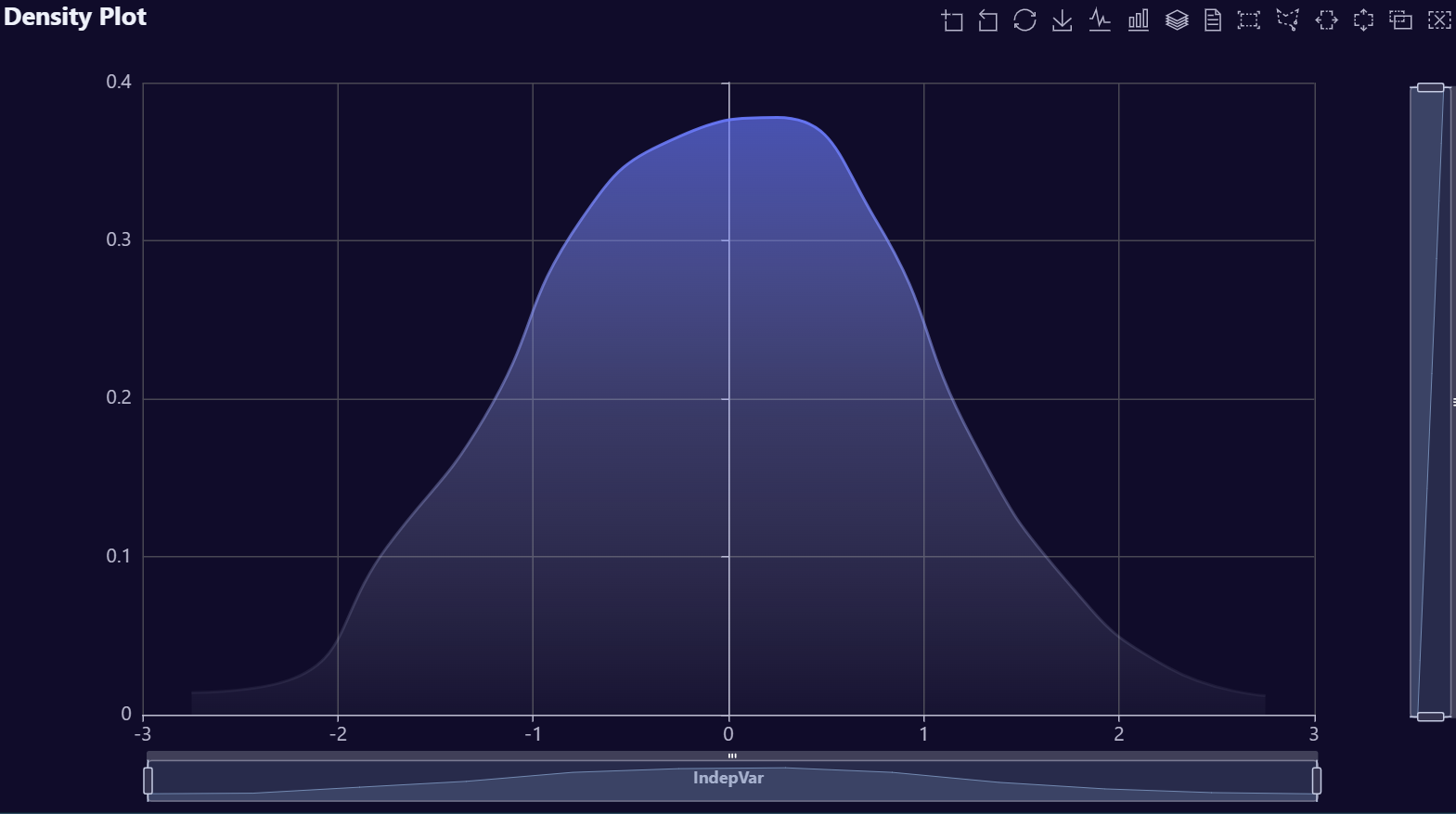
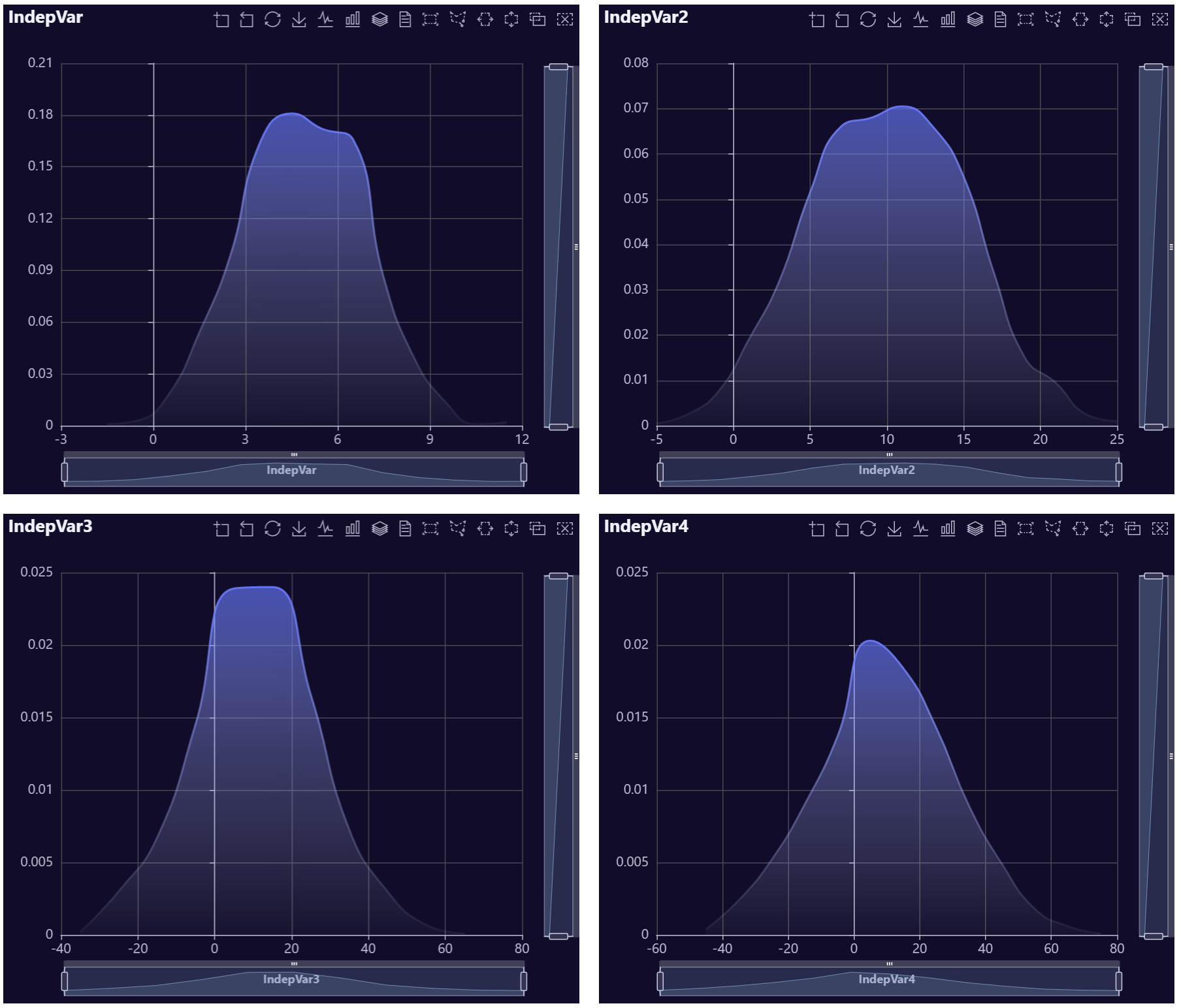
Density Plot Examples
# Create fake data
data <- data.table::data.table(IndepVar = rnorm(1000, mean = 0, sd = 1))

# Build plot
AutoPlots::Density(
  dt = data,
  XVar = "IndepVar"
)
# Create fake data
data <- data.table::data.table(IndepVar = rnorm(1000, mean = 5, sd = 2))
data[, IndepVar2 := rnorm(1000, mean = 10, sd = 5)]
data[, IndepVar3 := rnorm(1000, mean = 10, sd = 15)]
data[, IndepVar4 := rnorm(1000, mean = 10, sd = 20)]

# Build Plots
p1 <- AutoPlots::Density(
  dt = data,
  XVar = "IndepVar",
  title.text = "IndepVar"
)

p2 <- AutoPlots::Density(
  dt = data,
  XVar = "IndepVar2",
  title.text = "IndepVar2"
)

p3 <- AutoPlots::Density(
  dt = data,
  XVar = "IndepVar3",
  title.text = "IndepVar3"
)

p4 <- AutoPlots::Density(
  dt = data,
  XVar = "IndepVar4",
  title.text = "IndepVar4"
)

AutoPlots::display_plots_grid(
  list(p1,p2,p3,p4),
  cols = 2
)
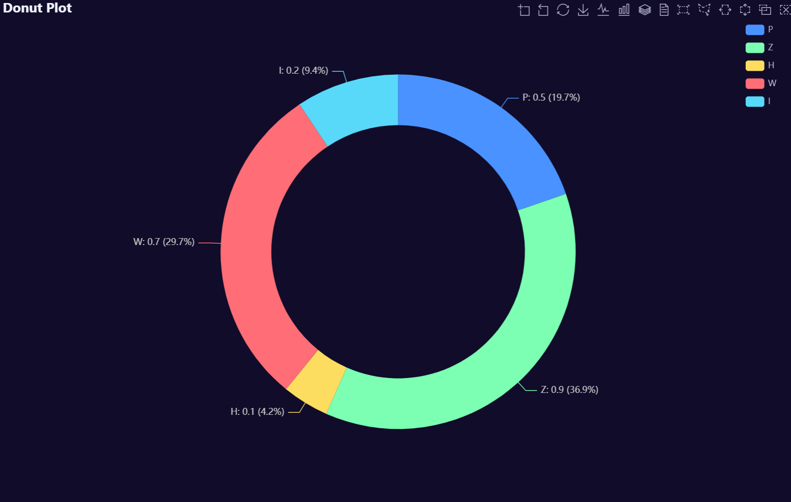
Donut Plot Examples
# Create fake data
data <- AutoPlots::FakeDataGenerator(N = 1000)
data <- data[, .(
  IndepVar = round(mean(Independent_Variable8), 3)
), by = c("Factor_1")]

# Build Plot
AutoPlots::Donut(
  dt = data,
  XVar = "Factor_1",
  YVar = "IndepVar"
)
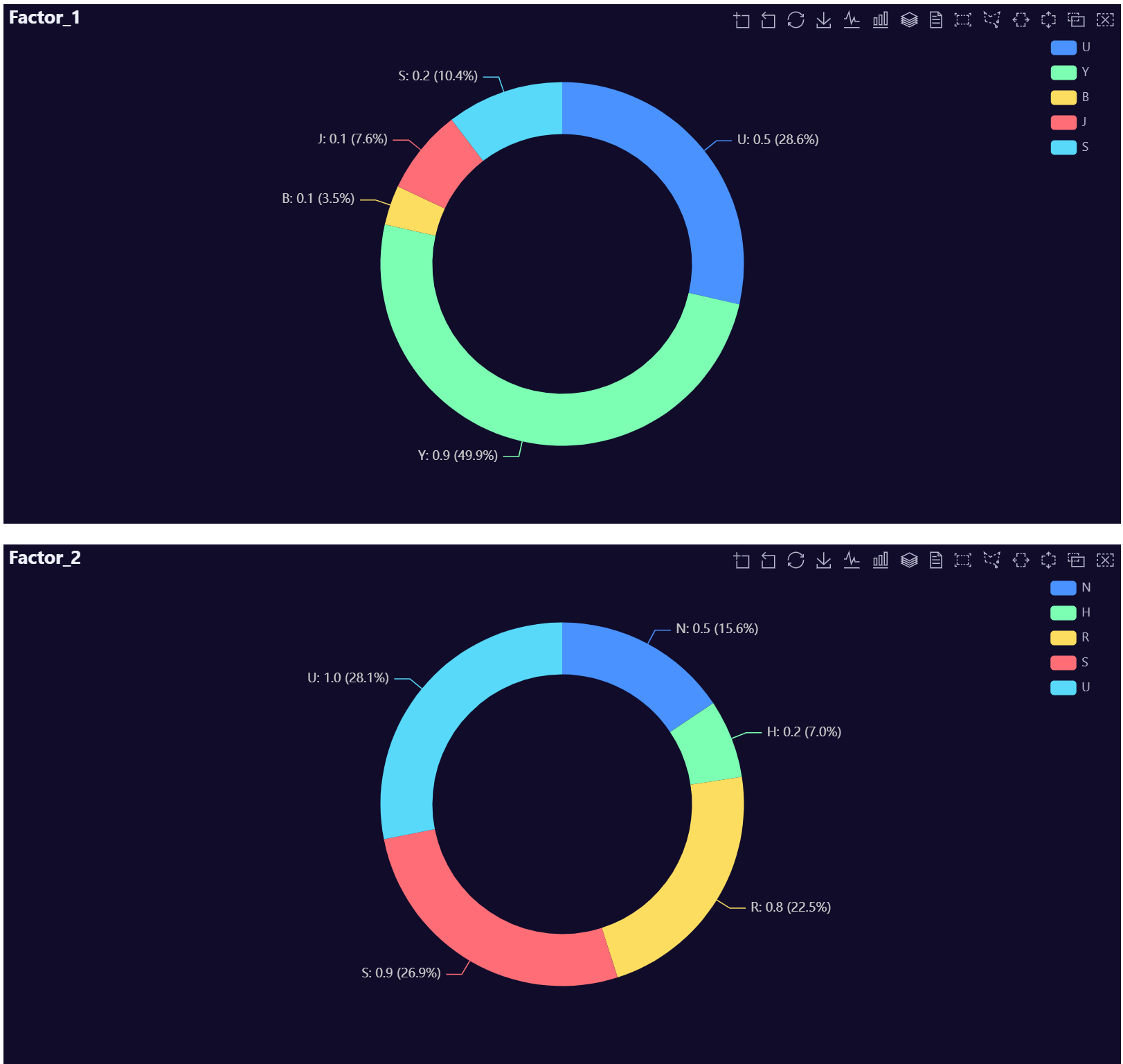
# Create fake data
data <- AutoPlots::FakeDataGenerator(N = 1000)
dt1 <- data[, .(
  IndepVar = round(mean(Independent_Variable8), 3)
), by = c("Factor_1")]
dt2 <- data[, .(
  IndepVar = round(mean(Independent_Variable8), 3)
), by = c("Factor_2")]

# Build Plots
p1 <- AutoPlots::Donut(
  dt = dt1,
  XVar = "Factor_1",
  YVar = "IndepVar",
  title.text = "Factor_1"
)

p2 <- AutoPlots::Donut(
  dt = dt2,
  XVar = "Factor_2",
  YVar = "IndepVar",
  title.text = "Factor_2"
)

AutoPlots::display_plots_grid(
  list(p1, p2),
  cols = 1
)
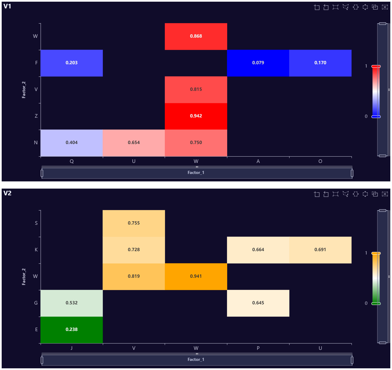
Heatmap Plot Examples
# Create fake data
data <- AutoPlots::FakeDataGenerator(N = 100000, Correlation = 0.1)
data <- data[, .(
  IndepVar = round(mean(Independent_Variable8), 3)
), by = c("Factor_1", "Factor_2")]

# Build Plots
AutoPlots::HeatMap(
  dt = data,
  XVar = "Factor_1",
  YVar = "Factor_2",
  ZVar = "IndepVar"
)
# Create fake data
data <- AutoPlots::FakeDataGenerator(N = 100000, Correlation = 0.1)
data <- data[, .(
  IndepVar = round(mean(Independent_Variable8), 3)
), by = c("Factor_1", "Factor_2")]

# Build Plots
p1 <- AutoPlots::HeatMap(
  dt = data,
  XVar = "Factor_1",
  YVar = "Factor_2",
  ZVar = "IndepVar",
  title.text = "V1"
)

# Create fake data
data <- AutoPlots::FakeDataGenerator(N = 100000, Correlation = 0.1)
data <- data[, .(
  IndepVar = round(mean(Independent_Variable8), 3)
), by = c("Factor_1", "Factor_2")]

# Build Plots
p2 <- AutoPlots::HeatMap(
  dt = data,
  XVar = "Factor_1",
  YVar = "Factor_2",
  ZVar = "IndepVar",
  title.text = "V2",
  visualMap.InRange.color = c("green", "white", "orange")
)

AutoPlots::display_plots_grid(
  list(p1, p2),
  cols = 1
)
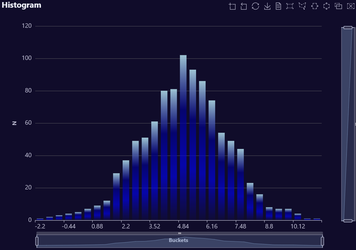
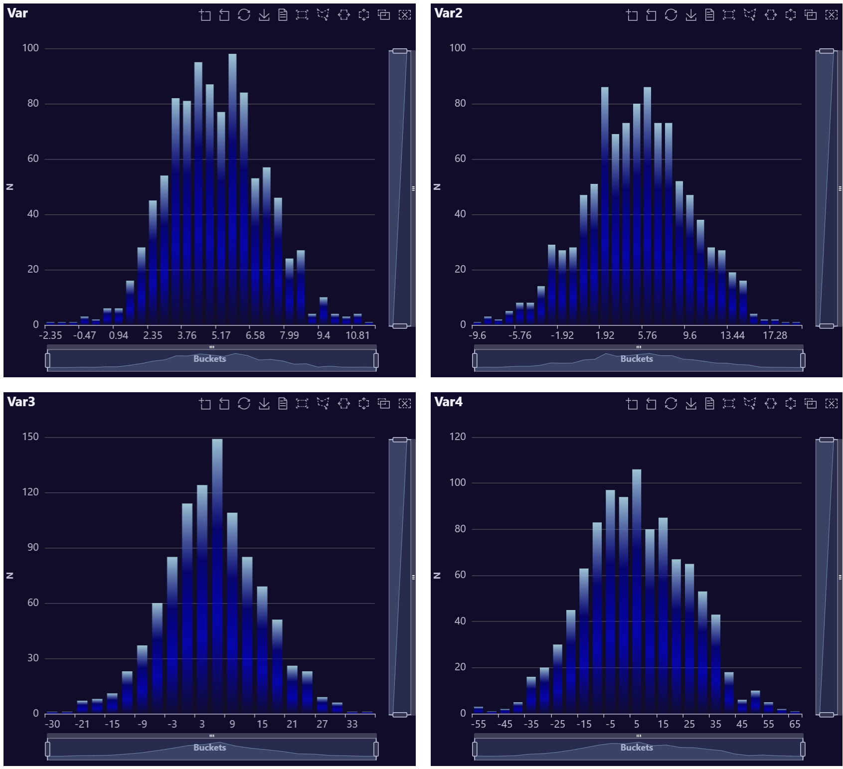
Histogram Examples
# Create fake data
data <- data.table::data.table(Variable = rnorm(n = 1000, mean = 5, sd = 2))

# Build Plots
AutoPlots::Histogram(
  dt = data,
  XVar = "Variable"
)
# Create fake data
data <- data.table::data.table(Variable = rnorm(n = 1000, mean = 5, sd = 2))
data[, Variable2 := rnorm(n = 1000, mean = 5, sd = 5)]
data[, Variable3 := rnorm(n = 1000, mean = 5, sd = 10)]
data[, Variable4 := rnorm(n = 1000, mean = 5, sd = 20)]

# Build Plots
p1 <- AutoPlots::Histogram(
  dt = data,
  XVar = "Variable",
  title.text = "Var"
)

p2 <- AutoPlots::Histogram(
  dt = data,
  XVar = "Variable2",
  title.text = "Var2"
)

p3 <- AutoPlots::Histogram(
  dt = data,
  XVar = "Variable3",
  title.text = "Var3"
)

p4 <- AutoPlots::Histogram(
  dt = data,
  XVar = "Variable4",
  title.text = "Var4"
)

AutoPlots::display_plots_grid(
  list(p1,p2,p3,p4),
  cols = 2
)
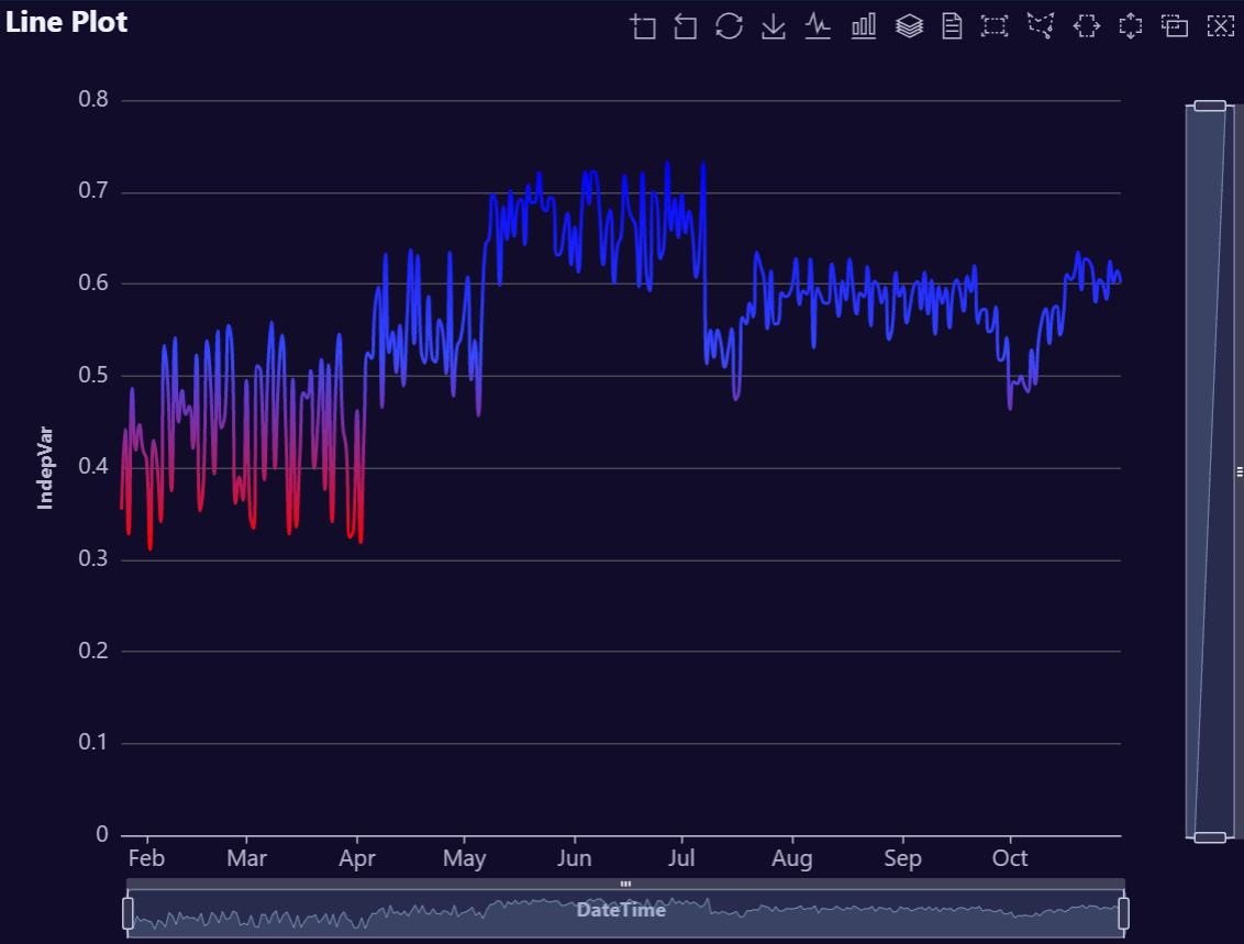
Line Plot Examples
# Create example data (no FakeDataGenerator)
data <- data.table::data.table(
  DateTime = seq.Date(
    from = Sys.Date() - 89,
    to   = Sys.Date(),
    by   = "day"
  )
)

# Smooth wave + a bit of noise for a nice area shape
data[, IndepVar := 50 +
       30 * sin(seq(0, 2 * pi, length.out = .N)) +
       stats::rnorm(.N, mean = 0, sd = 3)]

# Optional: ensure values stay positive for cleaner visuals
data[IndepVar < 0, IndepVar := 0]
data[, IndepVar2 := jitter(IndepVar, amount = 5)]
data[, Var2 := jitter(IndepVar, amount = 25)]
data[, Var3 := jitter(Var2, amount = 25)]

# Build plot
AutoPlots::Line(
  dt = data,
  XVar = "DateTime",
  YVar = "IndepVar",
  title.text = "Line Plot",
  title.subtext = "Theme: dark"
)
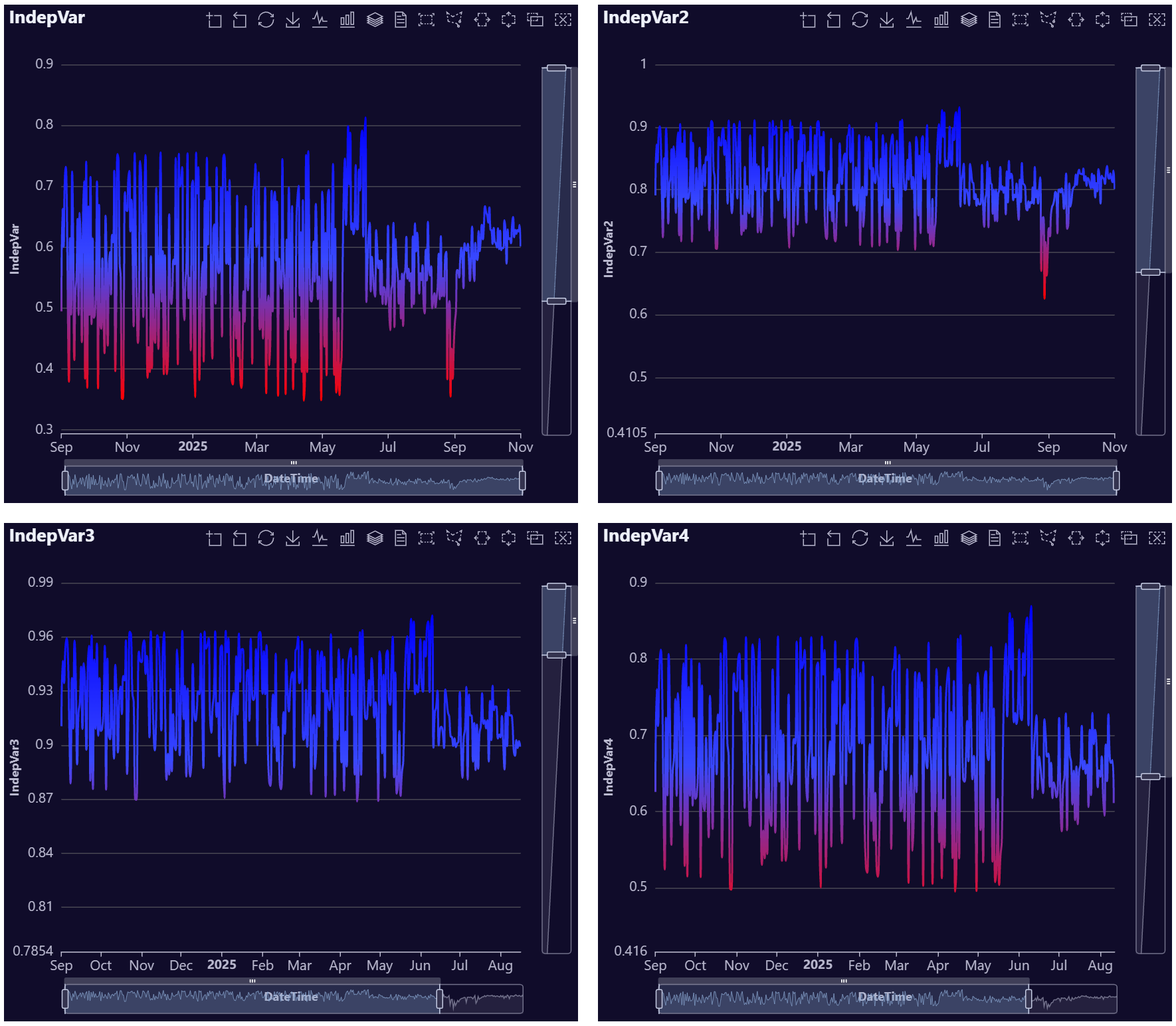
# Create data
data <- AutoPlots::FakeDataGenerator(N = 1000, AddDate = T)
data <- data[, .(
  IndepVar = mean(Independent_Variable8),
  IndepVar2 = mean(Independent_Variable7),
  IndepVar3 = mean(Independent_Variable6),
  IndepVar4 = mean(Independent_Variable5)
), by = c("DateTime")]

# Build plot
p1 <- AutoPlots::Line(
  dt = data,
  XVar = "DateTime",
  YVar = "IndepVar",
  title.text = "IndepVar"
)

p2 <- AutoPlots::Line(
  dt = data,
  XVar = "DateTime",
  YVar = "IndepVar2",
  title.text = "IndepVar2"
)

p3 <- AutoPlots::Line(
  dt = data,
  XVar = "DateTime",
  YVar = "IndepVar3",
  title.text = "IndepVar3"
)

p4 <- AutoPlots::Line(
  dt = data,
  XVar = "DateTime",
  YVar = "IndepVar4",
  title.text = "IndepVar4"
)

AutoPlots::display_plots_grid(
  list(p1,p2,p3,p4),
  cols = 2
)
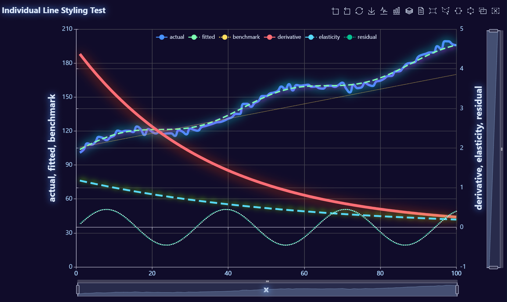
library(data.table)
library(AutoPlots)

set.seed(123)

# Fake data
test_dt <- data.table(x = 1:100)

test_dt[, `:=`(
  actual     = 100 + 0.90 * x + 8 * sin(x / 7) + rnorm(.N, 0, 2),
  fitted     = 102 + 0.88 * x + 6 * sin(x / 7),
  benchmark  = 105 + 0.65 * x,
  derivative = 4.5 * exp(-x / 35),
  elasticity = 1.2 * exp(-x / 55),
  residual   = 0.45 * sin(x / 5)
)]

AutoPlots::Line(
  dt = test_dt,
  XVar = "x",
  YVar = c("actual", "fitted", "benchmark"),
  DualYVar = c("derivative", "elasticity", "residual"),
  lineStyle.width = c(5, 3, 1, 6, 4, 2)
  lineStyle.type = c("solid", "dashed", "dotted", "solid", "dashed", "dotted"),
  lineStyle.shadowBlur = c(20, 10, 0, 25, 12, 0),
  lineStyle.shadowOffsetX = c(0, 2, 0, -2, 0, 2),
  lineStyle.shadowOffsetY = c(0, 2, 0, 2, -2, 0),
  lineStyle.shadowColor = c("#00FFFF", "#FF00FF", "#FFFF00", "#FF4500", "#7FFF00", "#FFFFFF"),
  title.text = "Individual Line Styling Test",
  legend.orient = "horizontal",
  legend.top = 70,
  legend.right = 280
)
Parallel Plot Examples
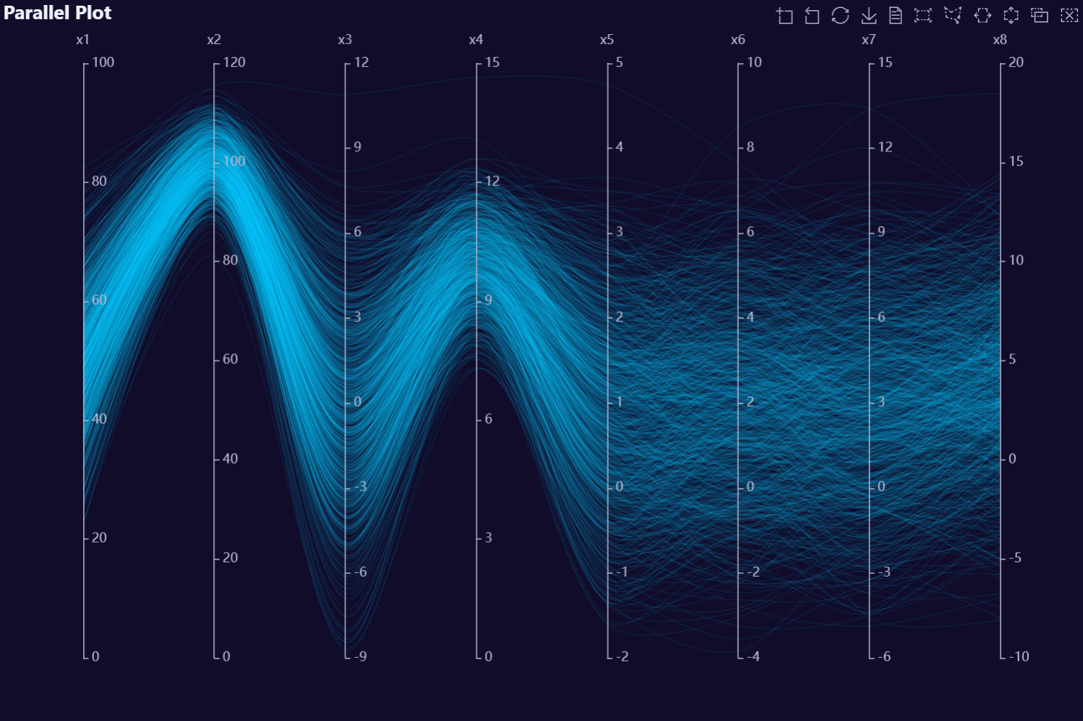
# Create data
n   <- 1000        # rows
p   <- 8           # number of variables
rho <- 0.8         # correlation between neighbors (AR(1))
mu  <- c(50, 100, 0, 10,1,2,3,4)     # means (length p)
sds <- c(10, 5, 3, 1, 1,2,3,4)        # standard deviations (length p)
Sigma_cor <- outer(1:p, 1:p, \(i, j) rho^abs(i - j))   # AR(1) correlation matrix
L <- chol(Sigma_cor)                                   # Cholesky factor (upper-tri)
Z <- matrix(rnorm(n * p), nrow = n, ncol = p)          # iid N(0,1)
X_cor <- Z %*% L                                       # correlated, unit variance
X <- X_cor %*% diag(sds)                               # set std devs
X <- sweep(X, 2, mu, `+`)                              # set means
dt <- data.table::as.data.table(X)
data.table::setnames(dt, paste0("x", seq_len(p)))

# Build Plot
AutoPlots::Parallel(
  dt = dt,
  CorrVars = names(dt)
)
# Create data
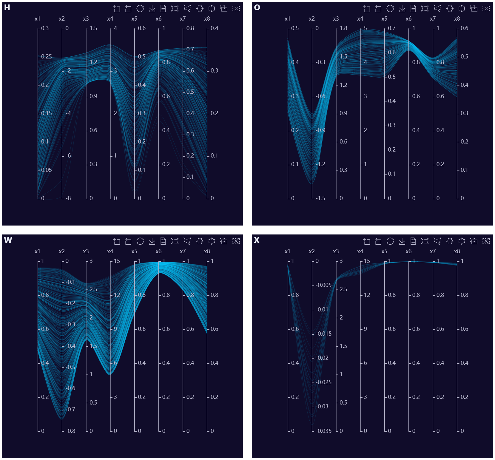
data <- AutoPlots::FakeDataGenerator(N = 1000, ID = 0)
data.table::setnames(
  data,
  paste0("Independent_Variable", 1:8),
  paste0("x", 1:8)
)

# Build Plots
group_vars <- sort(as.character(unique(data$Factor_1)))[1:4]
plot_list <- lapply(group_vars, function(x) {
  AutoPlots::Parallel(
    dt = data[Factor_1 == x],
    CorrVars = paste0("x", 1:8),
    title.text = x
  )
})

AutoPlots::display_plots_grid(
  plot_list,
  cols = 2
)
Pie Plot Examples
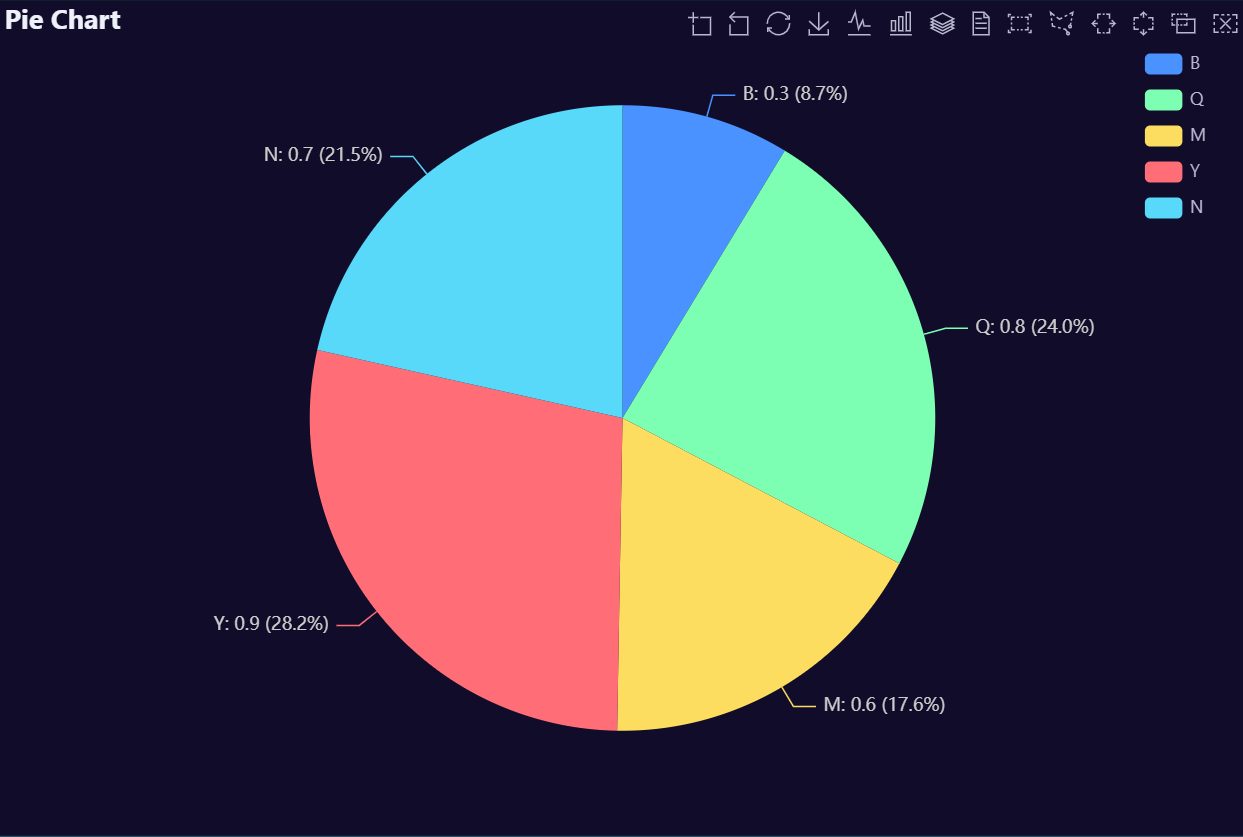
# Create fake data
data <- AutoPlots::FakeDataGenerator(N = 1000)
data <- data[, .(
  IndepVar = round(mean(Independent_Variable8), 3)
), by = c("Factor_1")]

# Build Plot
AutoPlots::Pie(
  dt = data,
  XVar = "Factor_1",
  YVar = "IndepVar"
)
# Create fake data
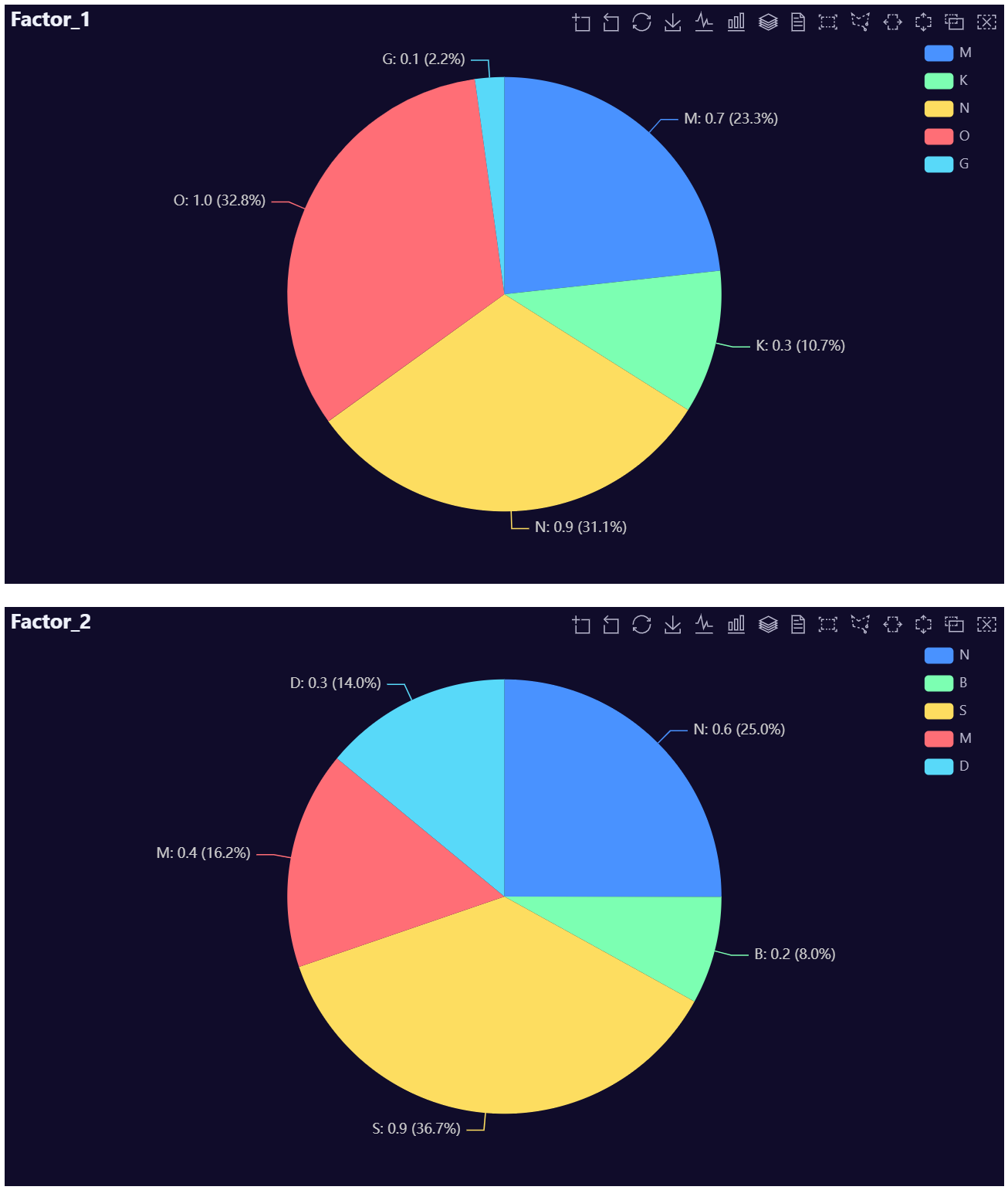
data <- AutoPlots::FakeDataGenerator(N = 1000)
dt1 <- data[, .(
  IndepVar = round(mean(Independent_Variable8), 3)
), by = c("Factor_1")]
dt2 <- data[, .(
  IndepVar = round(mean(Independent_Variable8), 3)
), by = c("Factor_2")]

# Build Plots
p1 <- AutoPlots::Pie(
  dt = dt1,
  XVar = "Factor_1",
  YVar = "IndepVar",
  title.text = "Factor_1",
)

p2 <- AutoPlots::Pie(
  dt = dt2,
  XVar = "Factor_2",
  YVar = "IndepVar",
  title.text = "Factor_2",
)

AutoPlots::display_plots_grid(
  list(p1, p2),
  cols = 1
)
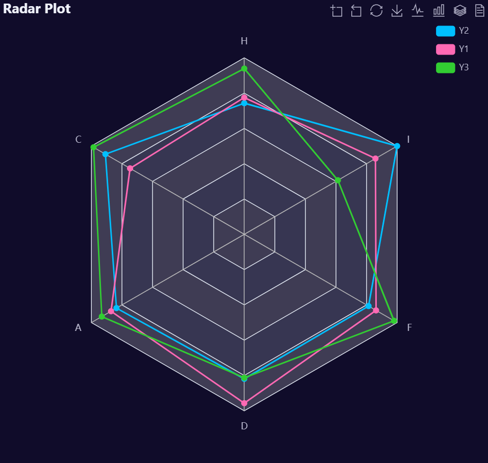
Radar Plot Examples
# Create Data
dt <- data.table::data.table(
  Y1 = pnorm(q = runif(10)),
  Y2 = pnorm(q = runif(10)),
  Y3 = pnorm(q = runif(10)),
  GV = sample(LETTERS[1:10], 10, TRUE))

# Create plot
AutoPlots::Radar(
  dt = dt,
  PreAgg = FALSE,
  YVar = c("Y1","Y2","Y3"),
  GroupVar = "GV"
)
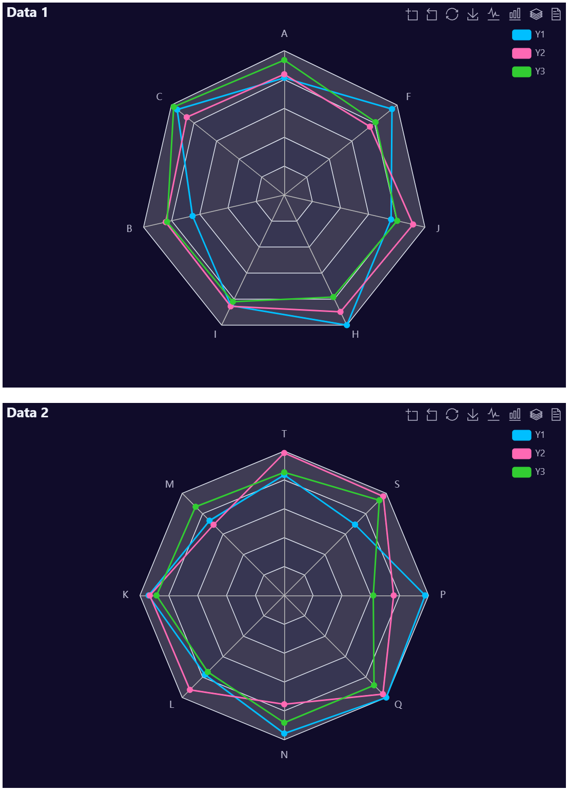
# Create Data
dt <- data.table::data.table(
  Y1 = pnorm(q = runif(10)),
  Y2 = pnorm(q = runif(10)),
  Y3 = pnorm(q = runif(10)),
  GV = sample(LETTERS[1:10], 10, TRUE))

dt2 <- data.table::data.table(
  Y1 = pnorm(q = runif(10)),
  Y2 = pnorm(q = runif(10)),
  Y3 = pnorm(q = runif(10)),
  GV = sample(LETTERS[11:20], 10, TRUE))

# Create plot
p1 <- AutoPlots::Radar(
  dt = dt,
  PreAgg = FALSE,
  YVar = c("Y1","Y2","Y3"),
  GroupVar = "GV",
  title.text = "Data 1",
)

p2 <- AutoPlots::Radar(
  dt = dt2,
  PreAgg = FALSE,
  YVar = c("Y1","Y2","Y3"),
  GroupVar = "GV",
  title.text = "Data 2",
)

AutoPlots::display_plots_grid(
  list(p1,p2),
  cols = 1
)
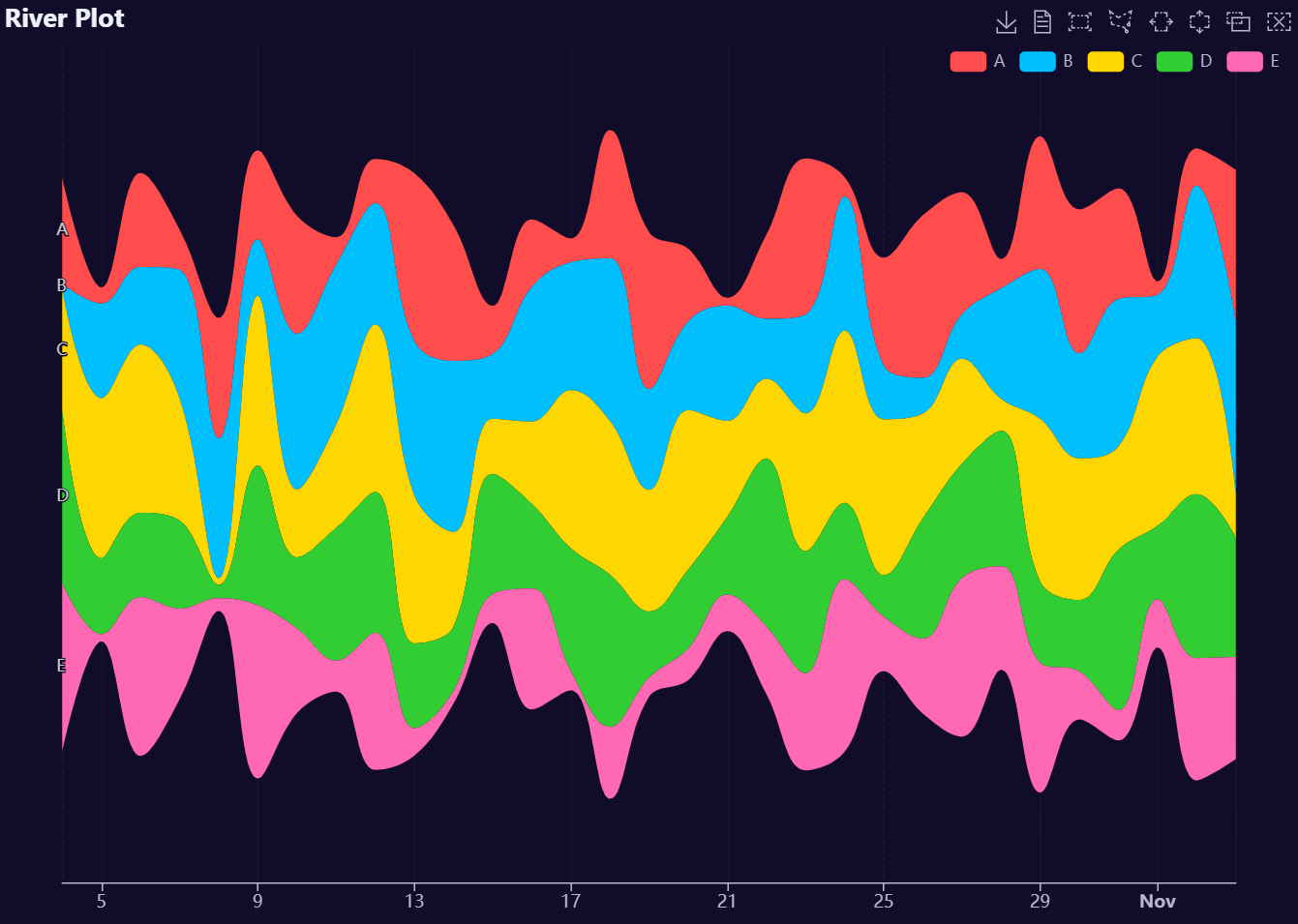
River Plot Examples
# Create fake data
dates <- seq.Date(Sys.Date() - 30, Sys.Date(), by = "day")
grps <- lapply(LETTERS[1:5], rep, 31) |> unlist()
dt <- data.table::data.table(
  dates = rep(dates, 5),
  groups = grps,
  values = runif(length(grps), 1, 50)
)

# Build Plot
AutoPlots::River(
  dt = dt,
  XVar = "dates",
  YVar = "values",
  GroupVar = "groups",
  legend.orient = "horizontal"
)
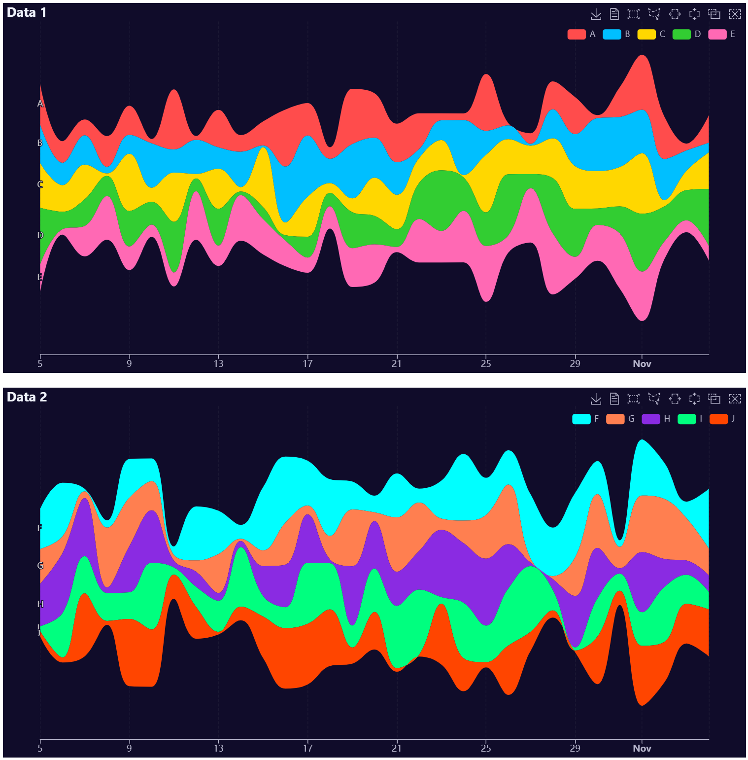
# Create fake data
dates <- seq.Date(Sys.Date() - 30, Sys.Date(), by = "day")
grps <- lapply(LETTERS[1:5], rep, 31) |> unlist()
dt1 <- data.table::data.table(
  dates = rep(dates, 5),
  groups = grps,
  values = runif(length(grps), 1, 50)
)

dates <- seq.Date(Sys.Date() - 30, Sys.Date(), by = "day")
grps <- lapply(LETTERS[6:10], rep, 31) |> unlist()
dt2 <- data.table::data.table(
  dates = rep(dates, 5),
  groups = grps,
  values = runif(length(grps), 1, 50)
)

# Build Plot
p1 <- AutoPlots::River(
  dt = dt1,
  XVar = "dates",
  YVar = "values",
  GroupVar = "groups",
  title.text = "Data 1",
  legend.orient = "horizontal"
)

p2 <- AutoPlots::River(
  dt = dt2,
  XVar = "dates",
  YVar = "values",
  GroupVar = "groups",
  title.text = "Data 2",
  legend.orient = "horizontal",
  itemStyle.color = c("#00FFFF", "#FF7F50", "#8A2BE2", "#00FF7F", "#FF4500"))

AutoPlots::display_plots_grid(
  list(p1, p2),
  cols = 1
)
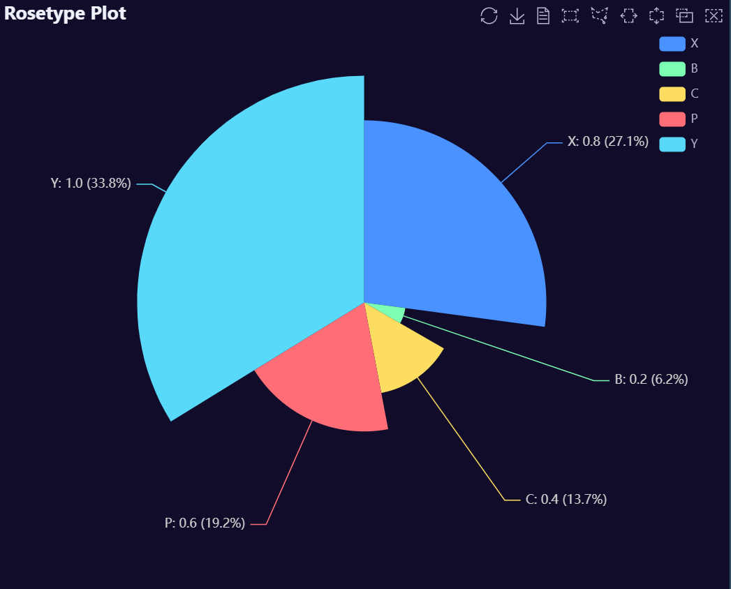
Rosetype Plot Examples
# Create fake data
data <- AutoPlots::FakeDataGenerator(N = 1000)
data <- data[, .(
  IndepVar = round(mean(Independent_Variable8), 3)
), by = c("Factor_1")]

# Build Plot
AutoPlots::Rosetype(
  dt = data,
  XVar = "Factor_1",
  YVar = "IndepVar"
)
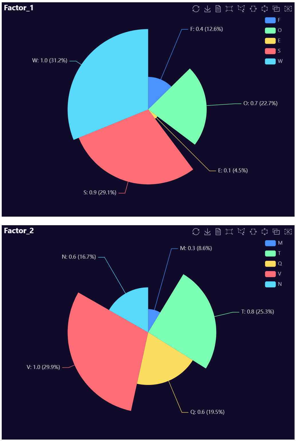
# Create fake data
data <- AutoPlots::FakeDataGenerator(N = 1000)
dt1 <- data[, .(
  IndepVar = round(mean(Independent_Variable8), 3)
), by = c("Factor_1")]
dt2 <- data[, .(
  IndepVar = round(mean(Independent_Variable8), 3)
), by = c("Factor_2")]

# Build Plots
p1 <- AutoPlots::Rosetype(
  dt = dt1,
  XVar = "Factor_1",
  YVar = "IndepVar",
  title.text = "Factor_1"
)

p2 <- AutoPlots::Rosetype(
  dt = dt2,
  XVar = "Factor_2",
  YVar = "IndepVar",
  title.text = "Factor_2"
)

AutoPlots::display_plots_grid(
  list(p1, p2),
  cols = 1
)
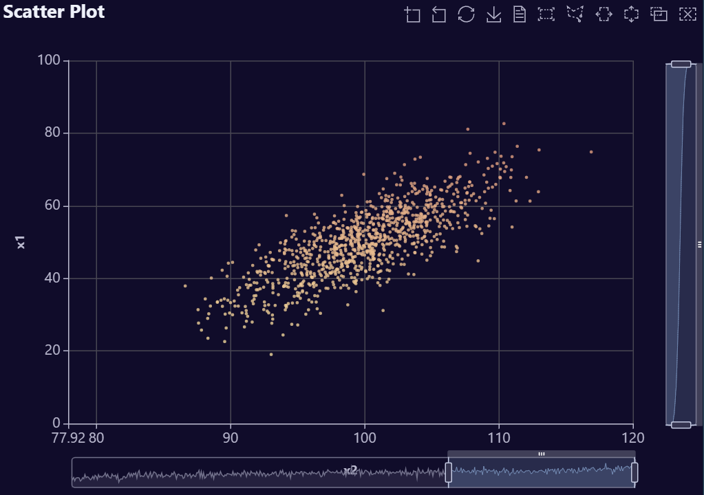
Scatter Plot Examples
# Create data
n   <- 1000        # rows
p   <- 4           # number of variables
rho <- 0.8         # correlation between neighbors (AR(1))
mu  <- c(50, 100, 0, 10)     # means (length p)
sds <- c(10, 5, 3, 1)        # standard deviations (length p)
Sigma_cor <- outer(1:p, 1:p, \(i, j) rho^abs(i - j))   # AR(1) correlation matrix
L <- chol(Sigma_cor)                                   # Cholesky factor (upper-tri)
Z <- matrix(rnorm(n * p), nrow = n, ncol = p)          # iid N(0,1)
X_cor <- Z %*% L                                       # correlated, unit variance
X <- X_cor %*% diag(sds)                               # set std devs
X <- sweep(X, 2, mu, `+`)                              # set means
dt <- data.table::as.data.table(X)
data.table::setnames(dt, paste0("x", seq_len(p)))

# Build Plot
AutoPlots::Scatter(
  dt = dt,
  XVar = "x2",
  YVar = "x1",
  legend.show = FALSE
)
# Create data
n   <- 1000        # rows
p   <- 4           # number of variables
rho <- 0.8         # correlation between neighbors (AR(1))
mu  <- c(50, 100, 0, 10)     # means (length p)
sds <- c(10, 5, 3, 1)        # standard deviations (length p)
Sigma_cor <- outer(1:p, 1:p, \(i, j) rho^abs(i - j))   # AR(1) correlation matrix
L <- chol(Sigma_cor)                                   # Cholesky factor (upper-tri)
Z <- matrix(rnorm(n * p), nrow = n, ncol = p)          # iid N(0,1)
X_cor <- Z %*% L                                       # correlated, unit variance
X <- X_cor %*% diag(sds)                               # set std devs
X <- sweep(X, 2, mu, `+`)                              # set means
dt <- data.table::as.data.table(X)
data.table::setnames(dt, paste0("x", seq_len(p)))

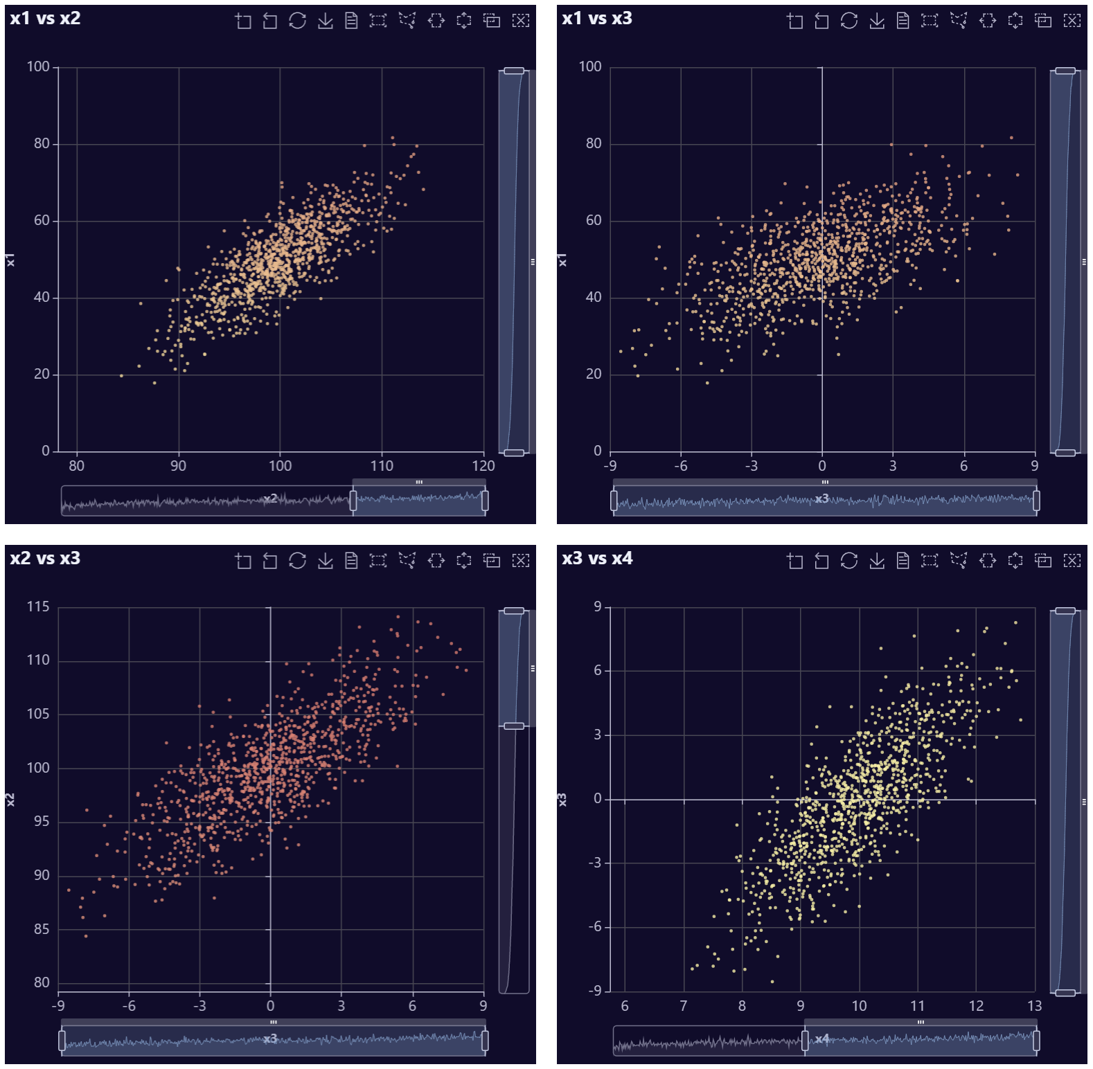
# Build Plots
p1 <- AutoPlots::Scatter(
  dt = dt,
  XVar = "x2",
  YVar = "x1",
  legend.show = FALSE,
  title.text = "x1 vs x2"
)

p2 <- AutoPlots::Scatter(
  dt = dt,
  XVar = "x3",
  YVar = "x1",
  legend.show = FALSE,
  title.text = "x1 vs x3"
)

p3 <- AutoPlots::Scatter(
  dt = dt,
  XVar = "x3",
  YVar = "x2",
  legend.show = FALSE,
  title.text = "x2 vs x3"
)

p4 <- AutoPlots::Scatter(
  dt = dt,
  XVar = "x4",
  YVar = "x3",
  legend.show = FALSE,
  title.text = "x3 vs x4"
)

AutoPlots::display_plots_grid(
  list(p1,p2,p3,p4),
  cols = 2
)
Stacked Bar Plot Examples
library(data.table)

set.seed(123)

# Nice, small, structured dataset
data <- data.table::CJ(
  Factor_1 = factor(
    paste0("Segment ", LETTERS[1:6]),
    levels = paste0("Segment ", LETTERS[1:6])
  ),
  Factor_2 = factor(
    c("Search", "Social", "Display", "Email"),
    levels = c("Search", "Social", "Display", "Email")
  )
)

data[, IndepVar := round(
  600 +                          # base level
    150 * as.integer(Factor_1) + # larger segments toward the right
    c(500, 350, 250, 150)[as.integer(Factor_2)] +  # channel strength
    rnorm(.N, 0, 80)             # a bit of noise
)]

# No negative values
data[IndepVar < 0, IndepVar := 0]

# Stacked bar example
AutoPlots::StackedBar(
  dt       = data,
  XVar     = "Factor_1",
  YVar     = "IndepVar",
  GroupVar = "Factor_2",
  legend.right = 35,
  legend.top   = 85,
  yAxis.nameTextStyle.padding = 60,
  yAxis.nameTextStyle.fontSize = 20,
  xAxis.nameTextStyle.fontSize = 20,
  legend.left = 200,
  legend.orient = "horizontal"
)
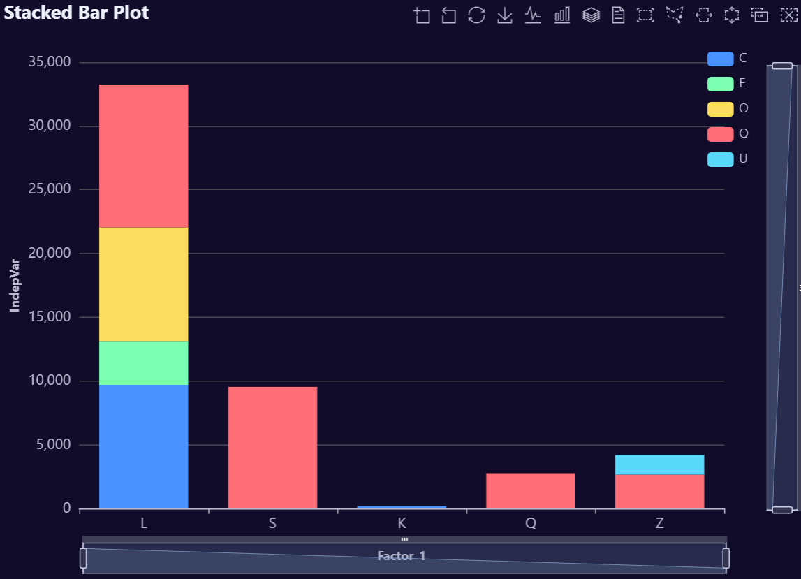
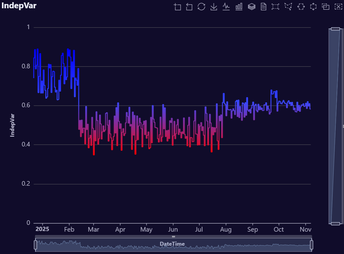
Step Plot Examples
# Create example data (no FakeDataGenerator)
data <- data.table::data.table(
  DateTime = seq.Date(
    from = Sys.Date() - 89,
    to   = Sys.Date(),
    by   = "day"
  )
)

# Smooth wave + a bit of noise for a nice area shape
data[, IndepVar := 50 +
       30 * sin(seq(0, 2 * pi, length.out = .N)) +
       stats::rnorm(.N, mean = 0, sd = 3)]

# Optional: ensure values stay positive for cleaner visuals
data[IndepVar < 0, IndepVar := 0]
data[, IndepVar2 := jitter(IndepVar, amount = 5)]
data[, Var2 := jitter(IndepVar, amount = 25)]
data[, Var3 := jitter(Var2, amount = 25)]

# Build plot
AutoPlots::Step(
  dt = data,
  XVar = "DateTime",
  YVar = "IndepVar",
  title.text = "Step Plot",
  title.subtext = "Theme: dark"
)
# Create data
data <- AutoPlots::FakeDataGenerator(N = 1000, AddDate = T)
data <- data[, .(
  IndepVar = mean(Independent_Variable8),
  IndepVar2 = mean(Independent_Variable7),
  IndepVar3 = mean(Independent_Variable6),
  IndepVar4 = mean(Independent_Variable5)
), by = c("DateTime")]

# Build plot
p1 <- AutoPlots::Step(
  dt = data,
  XVar = "DateTime",
  YVar = "IndepVar",
  title.text = "IndepVar",
  lineStyle.color = c("red","#3848FF","blue"),
  legend.show = FALSE
)

p2 <- AutoPlots::Step(
  dt = data,
  XVar = "DateTime",
  YVar = "IndepVar2",
  title.text = "IndepVar2",
  lineStyle.color = c("red","#3848FF","blue"),
  legend.show = FALSE
)

p3 <- AutoPlots::Step(
  dt = data,
  XVar = "DateTime",
  YVar = "IndepVar3",
  title.text = "IndepVar3",
  lineStyle.color = c("red","#3848FF","blue"),
  legend.show = FALSE
)

p4 <- AutoPlots::Step(
  dt = data,
  XVar = "DateTime",
  YVar = "IndepVar4",
  title.text = "IndepVar4",
  lineStyle.color = c("red","#3848FF","blue"),
  legend.show = FALSE
)

AutoPlots::display_plots_grid(
  list(p1,p2,p3,p4),
  cols = 2
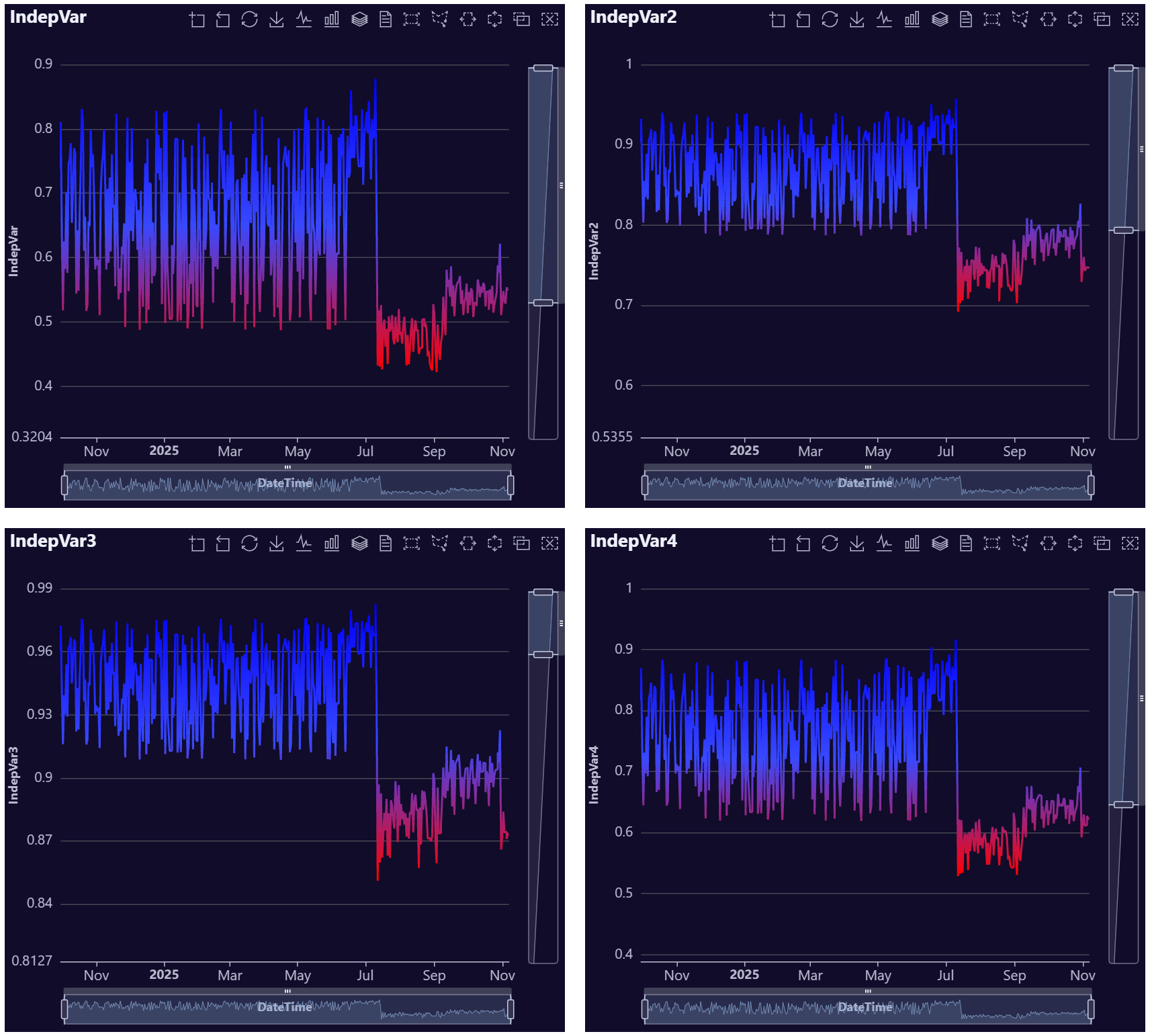
)
library(data.table)
library(AutoPlots)

set.seed(123)

# Fake data
test_dt <- data.table(x = 1:100)

test_dt[, `:=`(
  actual     = 100 + 0.90 * x + 8 * sin(x / 7) + rnorm(.N, 0, 2),
  fitted     = 102 + 0.88 * x + 6 * sin(x / 7),
  benchmark  = 105 + 0.65 * x,
  derivative = 4.5 * exp(-x / 35),
  elasticity = 1.2 * exp(-x / 55),
  residual   = 0.45 * sin(x / 5)
)]

AutoPlots::Step(
  dt = test_dt,
  XVar = "x",
  YVar = c("actual", "fitted", "benchmark"),
  DualYVar = c("derivative", "elasticity", "residual"),
  lineStyle.width = c(5, 3, 1, 6, 4, 2)
  lineStyle.type = c("solid", "dashed", "dotted", "solid", "dashed", "dotted"),
  lineStyle.shadowBlur = c(20, 10, 0, 25, 12, 0),
  lineStyle.shadowOffsetX = c(0, 2, 0, -2, 0, 2),
  lineStyle.shadowOffsetY = c(0, 2, 0, 2, -2, 0),
  lineStyle.shadowColor = c("#00FFFF", "#FF00FF", "#FFFF00", "#FF4500", "#7FFF00", "#FFFFFF"),
  title.text = "Individual Line Styling Test",
  legend.orient = "horizontal",
  legend.top = 70,
  legend.right = 280
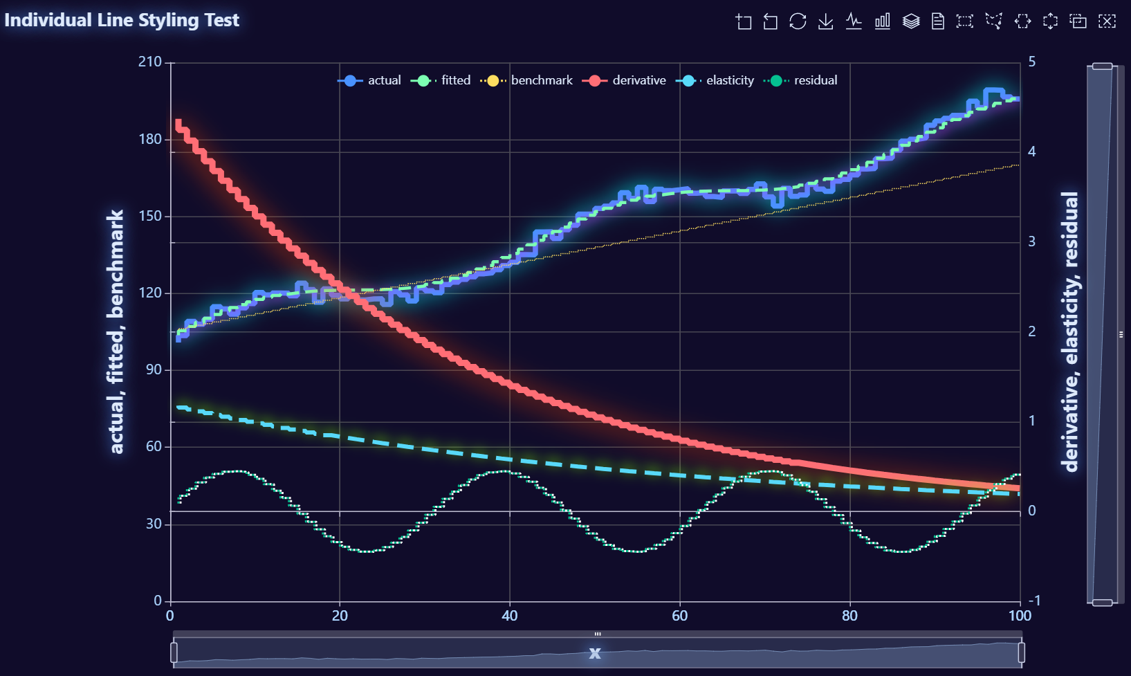
)
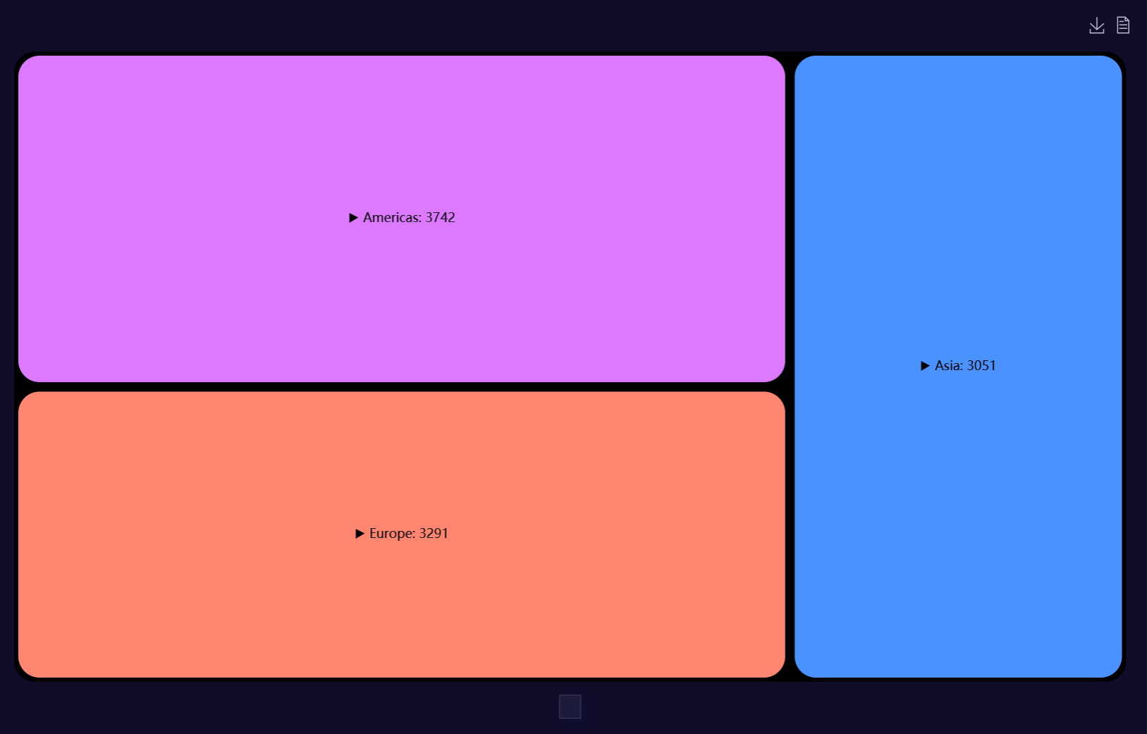
Treemap Plot Examples
library(data.table)
set.seed(123)

# Define hierarchy
continents  <- c("Americas", "Europe", "Asia")
countries   <- list(
  Americas = c("USA", "Canada", "Mexico"),
  Europe   = c("UK", "Germany", "Spain"),
  Asia     = c("China", "Japan", "India")
)
cities <- list(
  USA     = c("New York", "Los Angeles", "Chicago"),
  Canada  = c("Toronto", "Vancouver"),
  Mexico  = c("Mexico City", "Guadalajara"),
  UK      = c("London", "Manchester"),
  Germany = c("Berlin", "Hamburg"),
  Spain   = c("Madrid", "Barcelona"),
  China   = c("Beijing", "Shanghai"),
  Japan   = c("Tokyo", "Osaka"),
  India   = c("Mumbai", "Delhi")
)

neighborhoods <- list(
  "New York"     = c("Manhattan", "Brooklyn"),
  "Los Angeles"  = c("Hollywood", "Venice"),
  "Chicago"      = c("Loop", "Hyde Park"),
  "Toronto"      = c("North York", "Scarborough"),
  "Vancouver"    = c("Downtown", "Kitsilano"),
  "Mexico City"  = c("Centro", "Roma"),
  "Guadalajara"  = c("Zapopan", "Tlaquepaque"),
  "London"       = c("Camden", "Chelsea"),
  "Manchester"   = c("Salford", "Didsbury"),
  "Berlin"       = c("Mitte", "Kreuzberg"),
  "Hamburg"      = c("Altona", "Eimsbüttel"),
  "Madrid"       = c("Centro", "Chamartín"),
  "Barcelona"    = c("Gràcia", "Eixample"),
  "Beijing"      = c("Chaoyang", "Haidian"),
  "Shanghai"     = c("Pudong", "Xuhui"),
  "Tokyo"        = c("Shinjuku", "Shibuya"),
  "Osaka"        = c("Kita", "Namba"),
  "Mumbai"       = c("Bandra", "Andheri"),
  "Delhi"        = c("Karol Bagh", "Saket")
)

# Build the full dataset
dt <- rbindlist(lapply(names(countries), function(cont) {
  rbindlist(lapply(countries[[cont]], function(ctry) {
    rbindlist(lapply(cities[[ctry]], function(city) {
      data.table(
        Continent = cont,
        Country = ctry,
        City = city,
        Neighborhood = neighborhoods[[city]],
        Value = sample(50:500, length(neighborhoods[[city]]), replace = TRUE)
      )
    }))
  }))
}), use.names = TRUE)


# Build plot
AutoPlots::Treemap(
  dt = dt,
  YVar = "Value",
  GroupVar = c("Continent","Country","City","Neighborhood")
)
library(data.table)
set.seed(123)

# ----- Define hierarchy -------------------------------------------------------
continents  <- c("Americas", "Europe", "Asia")
countries   <- list(
  Americas = c("USA", "Canada", "Mexico"),
  Europe   = c("UK", "Germany", "Spain"),
  Asia     = c("China", "Japan", "India")
)
cities <- list(
  USA     = c("New York", "Los Angeles", "Chicago"),
  Canada  = c("Toronto", "Vancouver"),
  Mexico  = c("Mexico City", "Guadalajara"),
  UK      = c("London", "Manchester"),
  Germany = c("Berlin", "Hamburg"),
  Spain   = c("Madrid", "Barcelona"),
  China   = c("Beijing", "Shanghai"),
  Japan   = c("Tokyo", "Osaka"),
  India   = c("Mumbai", "Delhi")
)

neighborhoods <- list(
  "New York"     = c("Manhattan", "Brooklyn"),
  "Los Angeles"  = c("Hollywood", "Venice"),
  "Chicago"      = c("Loop", "Hyde Park"),
  "Toronto"      = c("North York", "Scarborough"),
  "Vancouver"    = c("Downtown", "Kitsilano"),
  "Mexico City"  = c("Centro", "Roma"),
  "Guadalajara"  = c("Zapopan", "Tlaquepaque"),
  "London"       = c("Camden", "Chelsea"),
  "Manchester"   = c("Salford", "Didsbury"),
  "Berlin"       = c("Mitte", "Kreuzberg"),
  "Hamburg"      = c("Altona", "Eimsbüttel"),
  "Madrid"       = c("Centro", "Chamartín"),
  "Barcelona"    = c("Gràcia", "Eixample"),
  "Beijing"      = c("Chaoyang", "Haidian"),
  "Shanghai"     = c("Pudong", "Xuhui"),
  "Tokyo"        = c("Shinjuku", "Shibuya"),
  "Osaka"        = c("Kita", "Namba"),
  "Mumbai"       = c("Bandra", "Andheri"),
  "Delhi"        = c("Karol Bagh", "Saket")
)

# ----- Build the full dataset -------------------------------------------------
dt <- rbindlist(
  lapply(names(countries), function(cont) {
    rbindlist(lapply(countries[[cont]], function(ctry) {
      rbindlist(lapply(cities[[ctry]], function(city) {
        n_nbhd <- length(neighborhoods[[city]])

        # base volume metric (e.g. revenue, signups)
        value <- sample(50:500, n_nbhd, replace = TRUE)

        # impressions & clicks for rate example
        imps  <- sample(1e3:1e4, n_nbhd, replace = TRUE)
        ctr   <- runif(n_nbhd, 0.01, 0.20) # 1%–20% click-through
        clicks <- pmin(round(imps * ctr), imps)

        data.table(
          Continent     = cont,
          Country       = ctry,
          City          = city,
          Neighborhood  = neighborhoods[[city]],
          Value         = value,
          Impressions   = imps,
          Clicks        = clicks
        )
      }))
    }))
  }),
  use.names = TRUE
)

# --------------------------------------------------------------------
# 2) Rate-based treemap – area by Click-through-rate (Clicks / Impressions)
#    (uses your new RateNumer / RateDenom / AreaMetric wiring)
# --------------------------------------------------------------------
AutoPlots::Treemap(
  dt       = dt,
  YVar     = c("Value", "Clicks", "Impressions"),
  GroupVar = c("Continent", "Country", "City", "Neighborhood"),
  RateNumer  = "Clicks",
  RateDenom  = "Impressions",
  AreaMetric = "rate"
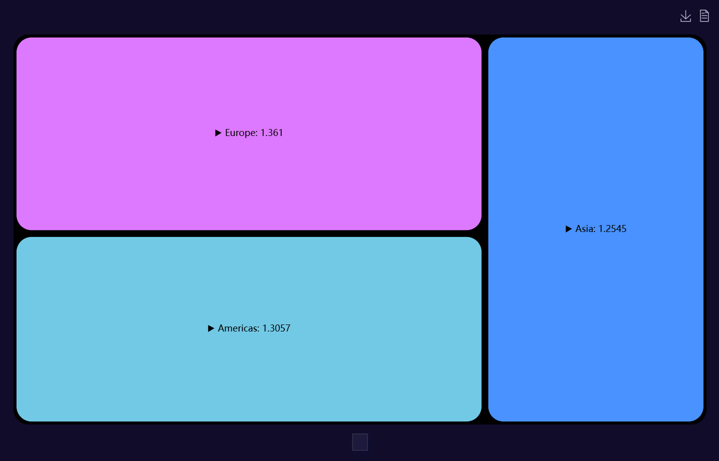
)